supplements · Teardown
Spacegoods
A vibrant, well-monetised store — strong brand, subscription-first buy box, and a cart that already upsells. The conversion gaps are ordering and hierarchy — what the first screen says, and how far the proof sits from the decision.
Spacegoods has the brand, the paid traffic, and genuinely good product education — and unlike most stores its size, the cart already does real work (free-shipping bar, a cross-sell, urgency). The conversion friction is upstream: what the first screen says, how far the proof sits from the decision, and how much the visitor has to scroll before the buy box earns the click. Here's the first-screen-to-cart walkthrough, grouped by page.
Home page
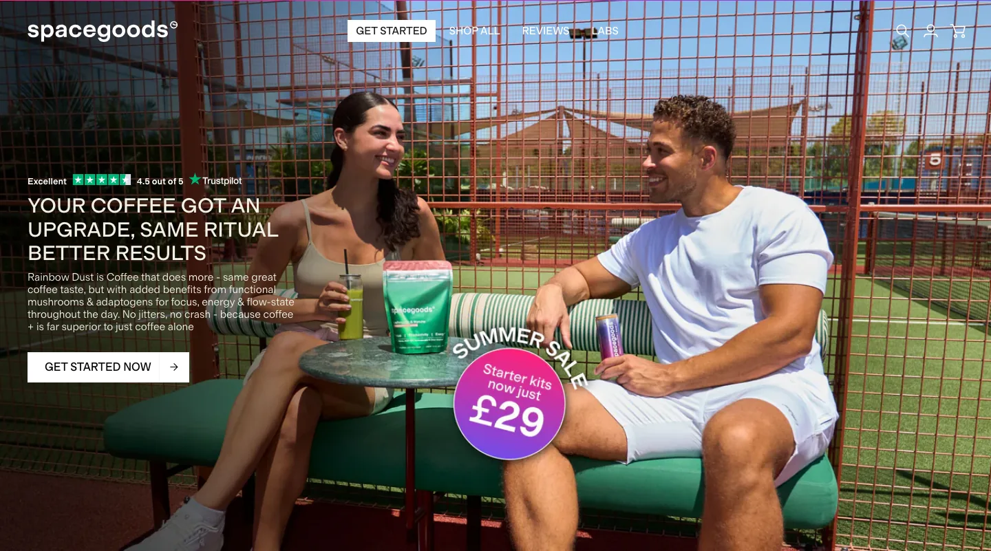
The hero leads with brand mood — "your coffee, upgraded / same ritual, better you" — over slick lifestyle photography. It looks premium, but a first-time visitor has to infer the actual outcome (calm, focused energy without the crash) rather than read it. The Trustpilot rating is present, which helps.
Fix: Anchor one outcome-led line above the product shot — the sentence that says what it does and what it replaces. Mood sells the brand; the sentence sells the product. Keep the rating where it is.
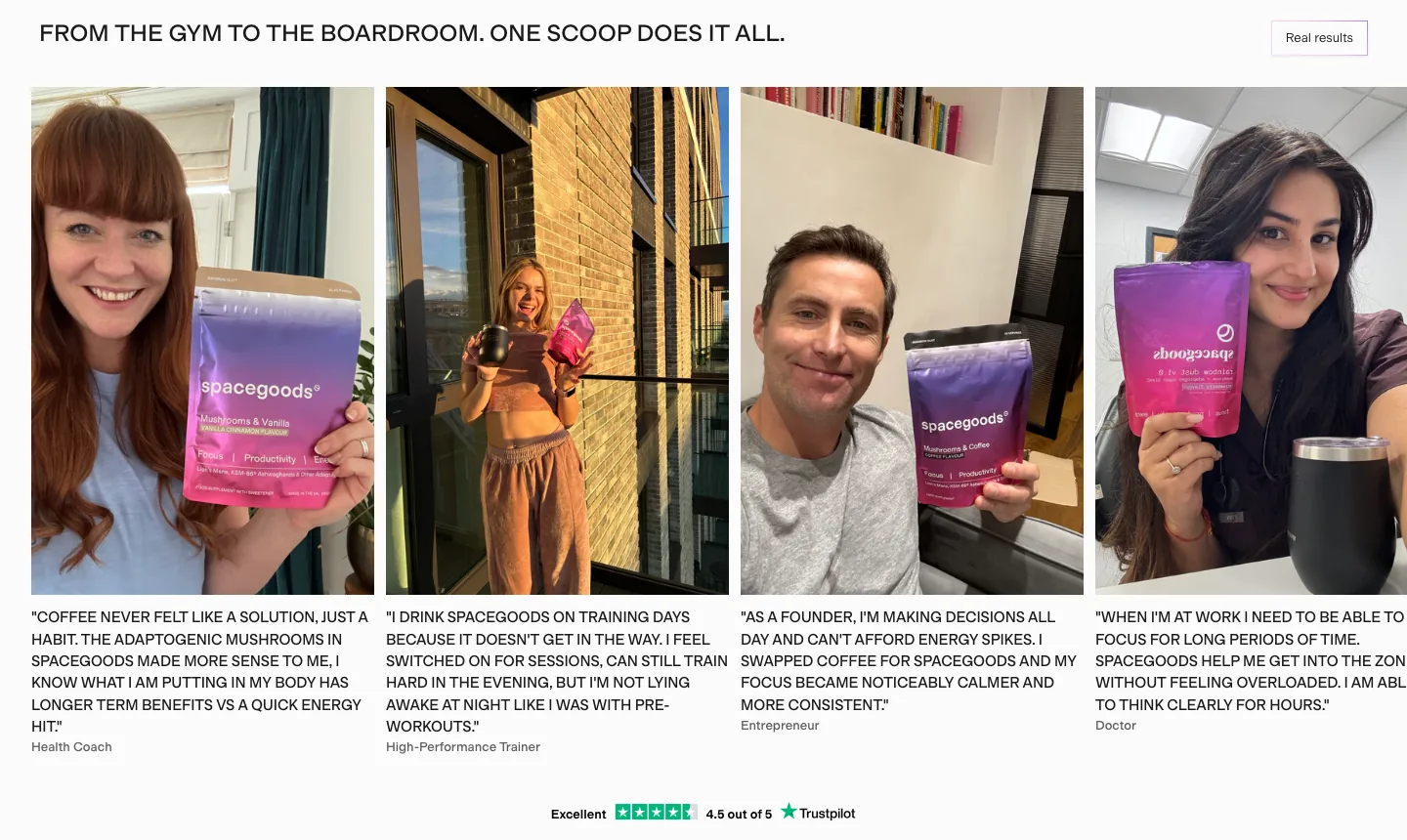
The strongest social proof — "from the gym to the boardroom, one scoop does it all," real customer results, 1M+ happy customers — lives well down the page. The first screen carries the rating but little hard, specific proof, so the early scroll asks for belief before it earns it.
Fix: Pull a compact proof strip (review count + one named result + a press/"as seen in" logo row) into the hero band, so evidence lands before the first scroll instead of after it.
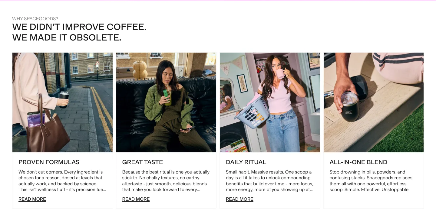
The positioning is bold and clear once you reach it — "we didn't improve coffee, we made it obsolete." But it sits inside a long, mood-led scroll, so the page's strongest claim and its proof are spread far apart. The order in which the story is told is doing less work than it could.
Fix: A Baseline rebuild tightens the first-screen → proof → offer sequence so the obsolete-coffee claim, the evidence, and the buy decision reinforce each other in one scroll instead of three. This is structure and hierarchy work, not a visual redesign — the brand system is already strong.
Product page
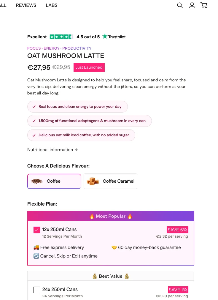
The buy box is clean and subscription-first — Trustpilot rating, price with a "Just Launched" anchor, three benefit chips, a flavour picker, and a "Most Popular" subscription plan pre-selected. But the only paths are subscribe-now plans; there's no obvious low-commitment way in, and the "Save more with flexible plan" toggle quietly governs whether the visitor is even buying a subscription.
Fix: Keep the pre-selected Most-Popular plan, but make the one-time / trial option visible and labelled, not hidden behind a toggle. First-time buyers convert better when the lowest-commitment yes is on the surface.
The PDP is education-rich — ingredients, "why thousands start their day," a 90-day transformation block, a coffee comparison — but it's a very long scroll, and the benefit content sits far below the buy decision. On mobile the buy box scrolls out of reach fast.
Fix: Add a sticky mini buy-bar on mobile (product, price, Add to Cart) so the decision is always one tap away, and lift one condensed benefit block directly under the buy box for scanners who won't read the full page.
The benefit percentages ("+33%", "81%", "84%", "80%") and "+30M servings" appear without a visible source. They're the most persuasive numbers on the page, but unsourced stats read as marketing and quietly erode trust on a health product — and they sit a long way from the buy box.
Fix: Attach a citation/footnote to each claim and surface a condensed version of these stats beside the buy box. In a Baseline engagement this is part of rebuilding the proof layer so the strongest evidence supports the decision instead of trailing it.
The buy box presents subscription plans well, but there's nothing low-ticket beside Add to Cart — no single-can trial, no frother, no sample of a second flavour. Every path is a recurring commitment, so there's no impulse-compatible way to lift the first order or de-risk the first purchase.
Fix: Add one Upsellr bump (Product/Bump placement, Compact) directly beside the CTA — a frother or a single-can trial. Small, obviously complementary, one click. It gives hesitant buyers a lower-commitment yes and lifts AOV for the rest.
Cart drawer
Credit where due — the cart drawer already does more than most — a free-shipping reward bar, an "Add to your order?" cross-sell (Rainbow Dust sample pack), an urgency timer, and a subtotal with savings. Two gaps remain. The free-shipping reward is already met at the first item (£24), so there's no incremental unlock to chase; and the cross-sell is a trial sample, not a reorder-driving consumable.
Fix: Add a second reward tier (a free gift above current AOV) so there's still something to unlock, and make the cross-sell a goal-matched consumable — a refill or a second flavour — so it compounds reorder value instead of only seeding a trial. Both run from a single Upsellr cart Goal + cross-sell.
Screens

What I'd fix
- 1Rebuild the first screen around a single outcome line — "calm, focused energy, no crash" — above the mood photography, so a first-time visitor reads the promise instead of inferring it.
- 2Pull a condensed 3-point proof block (Trustpilot rating, one benefit stat with its source, one comparison line) up beside the buy box; let the deep education continue below for researchers.
- 3Compress the long PDP scroll into a scannable system with a sticky mobile buy-bar, so the decision is always one tap away through the proof.
- 1Add one impulse bump beside Add to Cart (a single-can trial or a frother) — the buy box is subscription-only with nothing low-ticket to nudge the first order.
- 2Give the cart a second reward tier — free shipping is already met at £24, so add a free-gift goal above current AOV to create an unlock worth chasing.
- 3Swap the cart's sample-pack cross-sell for a goal-matched consumable (a refill or a second flavour) so it compounds reorder value, not just trial.
Want this fixed on your store?