home & cookware · Teardown
Our Place
On a phone this is a trust machine: a Kenji Lopez-Alt quote opens the page, 60,689 reviews back the PDP, and the cart already runs a free-ship bar and a cross-sell. What it lacks is a sticky mobile Add to Cart on a 13,794px PDP, a consent card that stops covering the buy box, and proof that lives where the thumb decides.
I went through Our Place the way its buyers actually do: one-handed, on a phone. The brand work is excellent: the testimonial carousel, the "Over 100,000 5-star reviews" band, the 60,689-review PDP. But the mobile mechanics keep getting in their own way: a 13,794px product page with a single Add to Cart near the top and nothing sticky after it, a cookie card that lands right over the option selector, and the strongest proof stranded thousands of pixels below the decision. I walked the thumb path first screen to checkout. Here's where the conversion leaks on mobile.
Home page
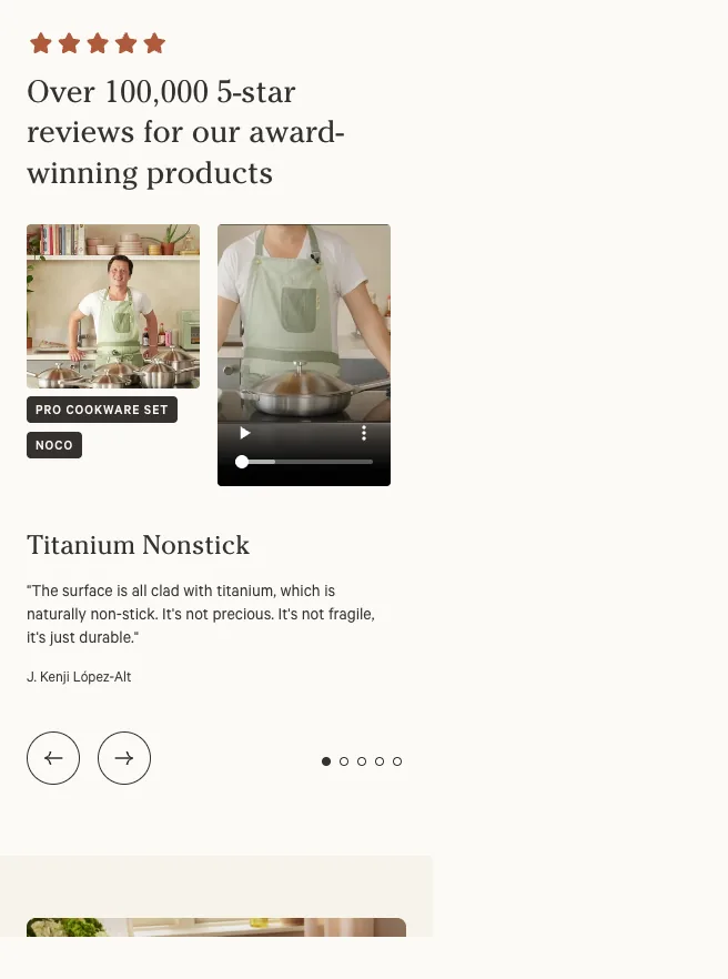
The mobile home opens on a testimonial carousel: a "PRO COOKWARE SET / NOCO" image plus autoplay video, the heading "Titanium Nonstick", and the quote "The surface is all clad with titanium… it's just durable. — J. Kenji Lopez-Alt", with prev/next arrows and five dots. No hero headline, value prop, or primary shop CTA appears before it.
Fix: The most valuable real estate on the phone is spending itself on an editorial quote instead of orienting a first-time visitor. I'd put a concise hero line (what this is plus a clear "Shop" CTA) above or merged into the testimonial. The Kenji quote is great proof; it just shouldn't be the thing that has to explain the brand on screen one.
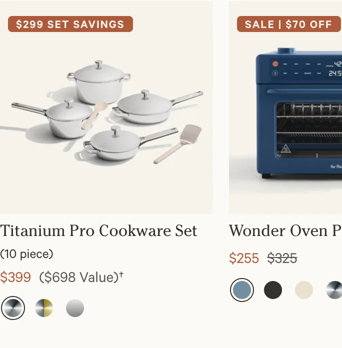
The "Shop Bestsellers" rail shows cards with strong discount badges ("$299 SET SAVINGS", "SALE | $70 OFF"): e.g. "Titanium Pro Cookware Set (10 piece) $399 ($698 Value)" and "Wonder Oven Pro $255 $325", each with a row of small color swatches. There's no visible Add button; the whole tile is the tap target into the PDP.
Fix: The value framing is doing its job: the struck-through anchors are clear. But the swatch dots are tight thumb targets, and with no quick-add every bestseller forces a full PDP load. I'd enlarge the swatch tap areas and add an optional quick-add so a high-intent rail can convert without dragging the buyer into a 13,794px page first.
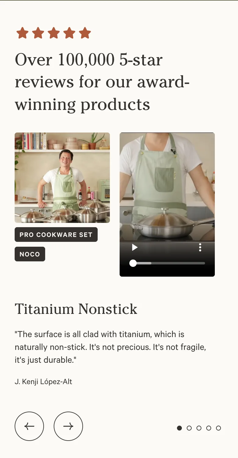
The home page runs a scrolling marquee ("FREE RETURNS · FREE SHIPPING OVER $…") above an "Over 100,000 5-star reviews for our award-winning products" band, then later a press-quote carousel ("Upgrade your cooking arsenal… with multi-use workhorses — Food Network"). The free-shipping threshold shows up as moving marquee text, not a concrete, cart-tied number.
Fix: The proof is strong but it reassures without directing the next tap. I'd state the threshold as a specific, actionable line ("Free shipping over $135") tied to the cart goal, and pair the 100,000-review band with a clear shop CTA on the same screen. In a Baseline pass this is structure work: let the proof point somewhere instead of just scrolling by.
Product page
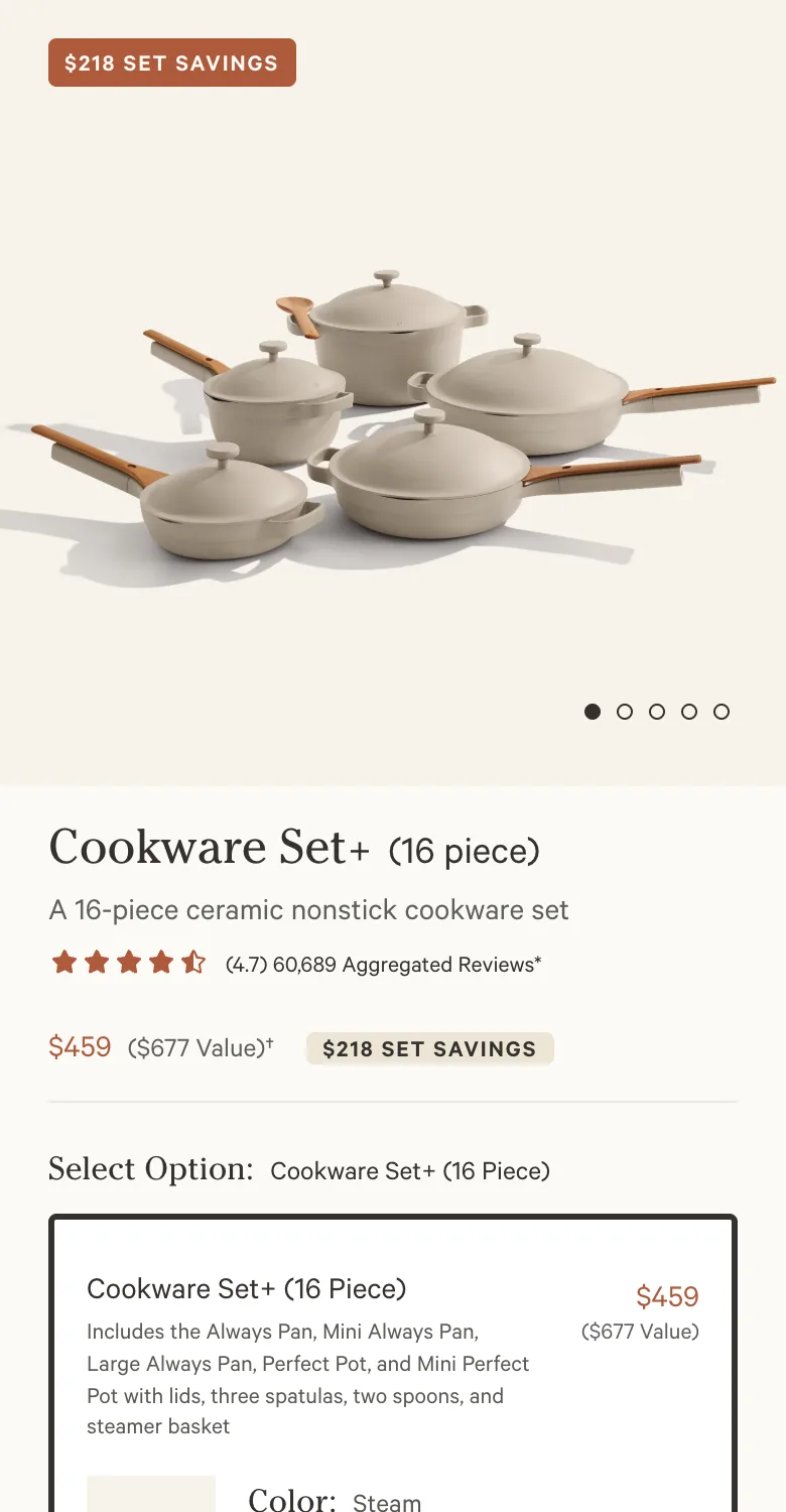
The mobile PDP renders 13,794px tall, and the only Add to Cart is the terracotta button in the buy box at roughly the top 13% of the page, under the "Cookware + Bakeware Set (18 Piece)" option card. Nothing fixed appears in any band below it: Why You'll Love It, What's Included, the editorial cards, the FAQ, the reviews all scroll past with no persistent buy action anywhere on screen.
Fix: This is the single highest-leverage mobile fix on the whole store. I'd add a sticky bottom ATC bar (price plus "Add to Cart") that slides in the moment the buy box scrolls off. On a page this tall, a buyer who reads even one section has to thumb all the way back to the top to act. A sticky bar keeps the yes one tap away the entire scroll.
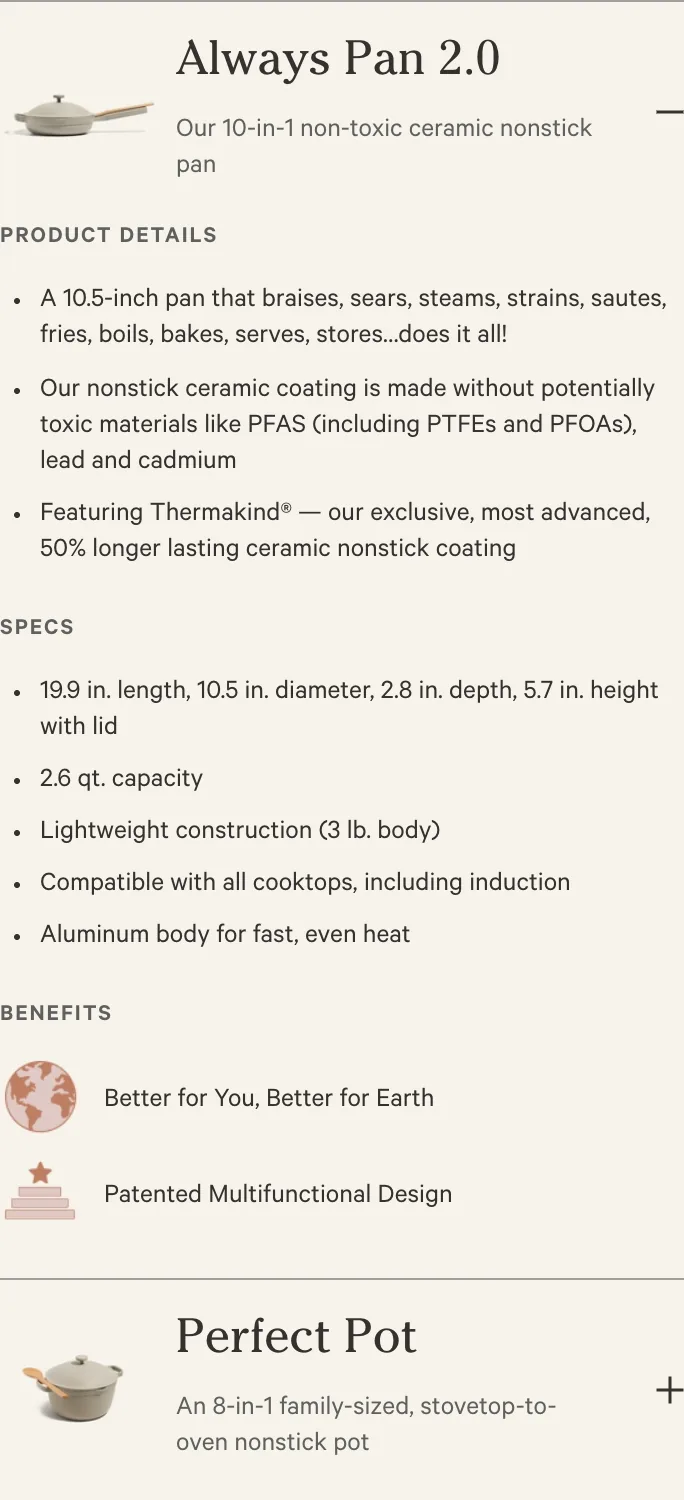
The captured PDP opens on a "BENEFITS" block and a related-products accordion (Perfect Pot, Large Always Pan, Mini Always Pan 2.0) before the "Select Option" selector and Add to Cart appear lower down. The price, the option tier, and the buy button all sit under spec bullets and a list of internal cross-links.
Fix: I'd pull the option selector and Add to Cart up above the spec bullets and the cross-link list. Right now the decision content is buried under content that's only useful after the visitor has decided to buy. Shortening the scroll-depth to the buy action shortens time-to-decision on a phone, where every extra swipe leaks intent.

On load, a cookie/consent banner ("Our Place and our vendors use cookies… Terms of Service … Privacy Policy … Cookie Preferences") renders as a large opaque card sitting directly over the "Select Option — Cookware Set+ (16 Piece)" header and the "Color — Steam" swatch row. The same card reappears over the homepage "Shop Bestsellers" area.
Fix: I'd move consent to a slim bottom-anchored bar. Right now it covers the exact two controls (option tier and color) a mobile shopper needs to touch first, so configuring the product costs a dismiss-tap before it even starts. A thin bottom bar satisfies the same legal requirement without blocking the buy controls at the worst possible moment.
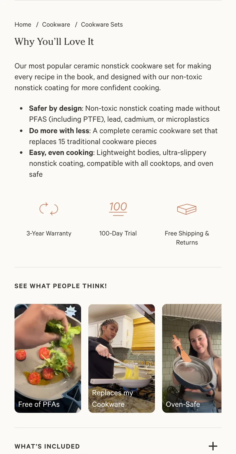
Below the buy box the PDP stacks "Why You'll Love It" bullets, three trust icons ("3-Year Warranty", "100-Day Trial", "Free Shipping & Returns"), a "SEE WHAT PEOPLE THINK!" UGC strip, and a "REVIEWS (60,689)" accordion. The buy box itself only carries "Free shipping $135+ and free returns" and the Klarna line, none of the heavy reassurance.
Fix: The most persuasive proof on the page (100-Day Trial, 3-Year Warranty, 60,689 reviews) sits hundreds of pixels below the Add to Cart. In a Baseline rebuild I'd surface a compact trust line (trial · warranty · review count and stars) inside or directly under the buy box, so a mobile buyer gets the reassurance at the exact moment of the add, not several swipes later.
Directly under the terracotta Add to Cart, the PDP shows only "Free shipping $135+ and free returns", "From $41/month or 0% interest with Klarna · Check purchase power", and footnotes. There's no order bump, no "Frequently bought together", no low-ticket add-on at the add moment. The bundle radio ("Cookware + Bakeware Set (18 Piece) $449, MOST SAVINGS") is the only AOV lever on the page.
Fix: The warmest second the buyer ever has (choosing the bundle and tapping Add to Cart) carries no attach offer at all. I'd drop one relevant lower-ticket bump near the ATC (a consumable, a utensil, a care or refill item). It's the classic second-sale move and it lifts AOV without touching the bundle decision the page already does well.
Cart drawer
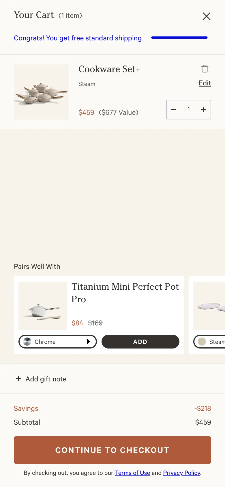
The owned slide-out drawer shows a "Congrats! You get free standard shipping" reward bar with a progress meter already fully cleared on this $459 order (Cookware Set+, "Steam", $459 / $677 Value, qty stepper plus Edit). Below the line item a "Pairs Well With" cross-sell carousel leads with the "Titanium Mini Perfect Pot Pro" at $84 (was $169), with a finish selector, an ADD button, and an arrow to more items. The footer carries "Savings -$218", subtotal, "Add gift note", and "Continue to Checkout".
Fix: Two mobile gaps. The free-shipping reward is met with no second tier behind it, so the meter has nothing left to chase. I'd add a second goal above the cleared bar (a gift-with-purchase at the next spend tier). And the carousel leads with an $84 considered buy, a hard yes in a slim drawer. I'd lead with a sub-$30 one-tap impulse add and let the Mini Perfect Pot Pro ride further down. Margin-check any added discount before committing it.
The "Pairs Well With" cross-sell is durable cookware (the Mini Perfect Pot Pro), not a refill, consumable, or care product. The line item is a one-time durable Cookware Set+ with nothing in the drawer that drives a reorder.
Fix: Cookware is a low-repurchase category, so a cross-sell of another pot does nothing for reorder or LTV. I'd offer a consumable or care attach (a ceramic-safe cleaning kit, replacement utensils, an oven mat) so the cart gives a reason to come back and a cheaper, more frequent second sale than another piece of cookware.
Screens

What I'd fix
- 1Add a persistent sticky mobile ATC bar (price + Add to Cart) that slides in once the buy box scrolls off, critical on a 13,794px PDP whose only Add to Cart sits near the top.
- 2Move the cookie/consent layer to a slim bottom-anchored bar so it stops covering the "Select Option" tier and color swatches on the PDP and the bestseller rail on home.
- 3Surface a compact trust line (100-Day Trial · 3-Year Warranty · 60,689 reviews) inside the buy box instead of stranding it hundreds of pixels below Add to Cart.
- 1Add one low-ticket order bump directly under Add to Cart (a utensil, care, or consumable item): the highest-intent tap currently carries no attach offer.
- 2Reorder the cart "Pairs Well With" carousel to lead with a sub-$30 one-tap impulse add instead of the $84 Titanium Mini Perfect Pot Pro.
- 3Add a second cart goal above the already-cleared free-shipping bar (a gift-with-purchase at the next tier) and include a consumable/care cross-sell to drive reorders on otherwise one-time cookware.
Want this fixed on your store?