supplements · Teardown
Lemme
A celebrity wellness brand with a genuinely advanced cart: a gift threshold, routine bundles, and per-item subscribe already live on Rebuy. The CRO gaps aren't monetisation; they're a hero that says nothing, an empty drawer that opens uninvited, and three different subscription discounts fighting each other.
 Shopify
 Rebuy
Rebuy Klaviyo
 Okendo
Lemme is further along than most brands we tear down. The cart is doing real work: a gift-with-purchase threshold, "Routine" bundle discounts, per-item subscribe-and-save, and a live savings total, all running on Rebuy. So the conversion opportunity here isn't whether they monetise; it's the front door. The hero doesn't say what the product is, an empty cart drawer opens before the visitor has done anything, and the subscription offer changes its number on every screen. Walkthrough, grouped by page.
Home page

The hero reads "The new standard in wellness" over a shelf of gummy bottles, with the supporting line selling a subscription discount ("save up to 35% off subscriptions") before it has said what the product does. A first-time visitor cannot tell from the first screen what Lemme is, who it's for, or which problem it solves. The category icons below (Mood, Sleep, Weight, Women's Health) carry more meaning than the headline.
Fix: Lead with what it is and who it's for in plain words, before any discount. Something like "Science-backed gummy supplements for sleep, energy, and digestion" says more in one line than the current headline plus its sub. Keep the subscription saving; move it below the product promise, not in front of it.

An "your bag" cart drawer opens on its own on both the home and product pages, showing "Your cart is empty!" with a list of shop links, before the visitor has added anything. It pushes the real content down and leads with a negative ("empty"), and it recurs on the PDP. A drawer that opens uninvited is friction, not merchandising, and an empty one is the worst version of it.
Fix: Trigger the drawer on add-to-cart only. The gift-threshold bar and the routine suggestions are good, but they belong the moment the buyer has a product in the bag, not as an interruption on arrival. Let the first screen be the product, not an empty cart.
This is a strength worth protecting. The home page stacks "Expert formulated, Validated by 3rd party testing, Science-backed innovation, Thousands of 5-star testimonials," a "what we leave out" free-from list (parabens, silicon dioxide, gluten, talc, synthetic colors, FD&C dyes), and the PDP carries 2,597 Okendo reviews at 4.7 stars. For a supplement brand, that credibility is the conversion foundation.
Fix: Leave the proof density alone; the fixes elsewhere are clarity and friction, not trust. If anything, pull one proof line (third-party tested, or the 4.7 rating) up into the hero so the credibility arrives with the product promise instead of a scroll later.
Product page
The Debloat PDP is enormous on mobile: hero, an auto-opened drawer, a product spotlight, benefit icons, an ingredient explainer, a free-from list, a cross-sell block, an FAQ accordion, then 2,597 reviews. The material is good, but the buy box scrolls out of reach almost immediately, and the buyer spends most of the page unable to act.
Fix: A Baseline rebuild adds a sticky mobile buy-bar so add-to-cart is always one tap away, and tightens the scroll so proof and ingredients support the buy box instead of burying it. This is page-system work, not a content problem; the content is already there.
The single clearest reason to buy ("probiotics that keep bloating at bay," the daily digestive-comfort promise) sits below the fold, under the auto-drawer and a spotlight for a different product (Lemme Chill). The first screen spends its attention on cart chrome and a cross-sell before it has sold the product the visitor came for.
Fix: Front-load the decision. On the first screen, put the product name, the 4.7 rating, the one-line benefit, and the buy box. Ingredients, the free-from list, and cross-sells step down from there. Order the page to the buyer's question ("what does this do for me, is it proven, how do I buy"), not to the store's merchandising.
The PDP recommends related products ("you're gonna love these," Lemme Purr) and spotlights Lemme Chill, but the calls to action are "Shop Now" and navigation links that take the buyer off the current product page. A cross-sell that requires leaving the page to act is a cross-sell that mostly loses the original purchase in progress.
Fix: Make the related-product cross-sells one-tap adds that drop into the bag without a page change, the way the cart already adds items. The buyer viewing Debloat should be able to add Purr in one tap and keep going, not restart on a new PDP. Keep it to one relevant complement, not a grid.
Cart drawer
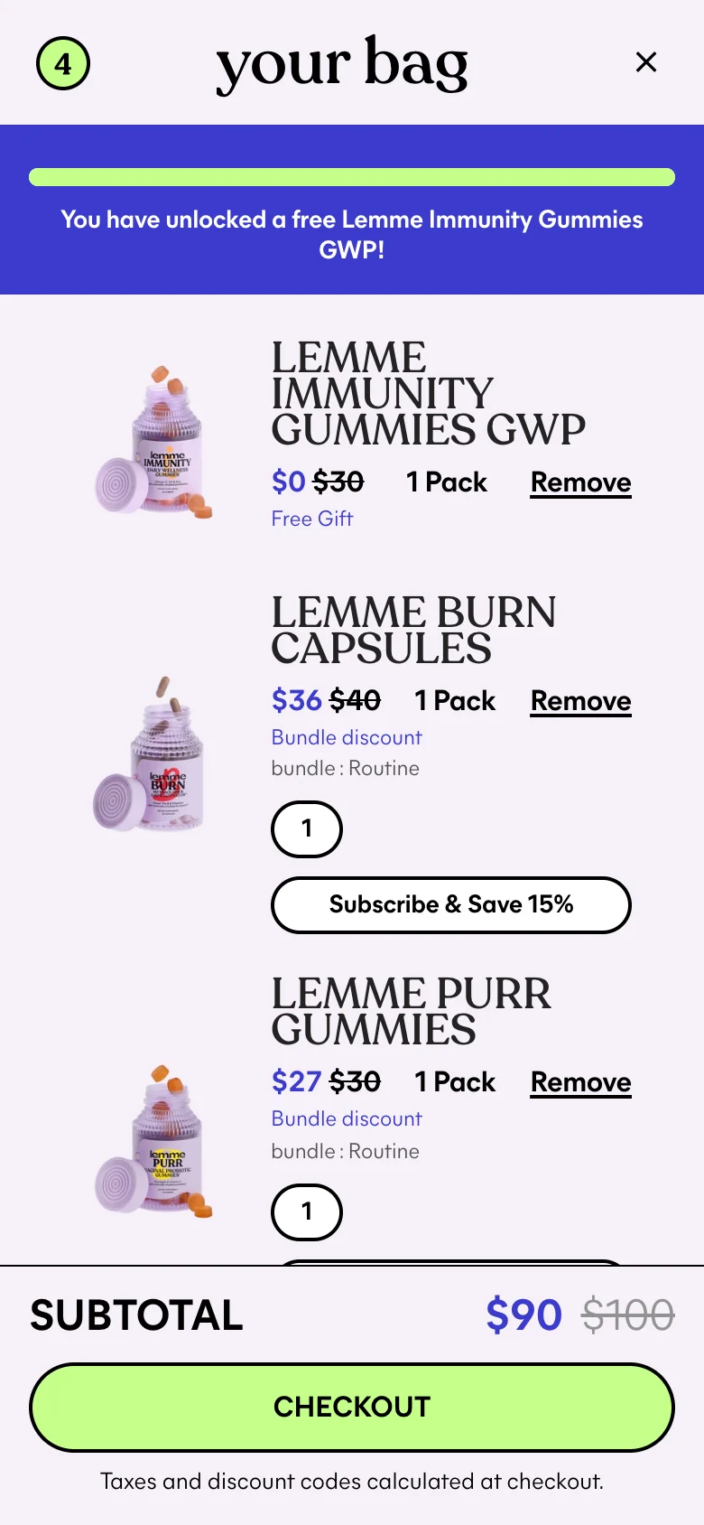
The subscription saving changes on every surface. The hero promises "up to 35% off subscriptions," a home block says "save up to 20% on your favorites," and the cart's per-item control offers "Subscribe & Save 15%." A buyer who reads all three doesn't see a generous offer; they see an inconsistent one, and inconsistency reads as untrustworthy at the exact moment trust converts.
Fix: Pick one headline subscription number and use it everywhere, with the tiering (if any) explained once, clearly. If 35% is real for a first order and 15% is the recurring rate, say that plainly. The saving is a strength; the three different numbers turn it into a question.
The cart is genuinely capable: the gift threshold is unlocked ("You have unlocked a free Lemme Immunity Gummies GWP"), the Routine bundle applies discounts, and each line offers subscribe-and-save, all on Rebuy. Rebuy is doing the pre-purchase and cart work well. The one surface it isn't working is after checkout, where there is no one-click post-purchase offer on the thank-you page, the highest-intent moment a buyer will ever have with the brand.
Fix: Add an Upsellr one-click post-purchase offer on the thank-you page: a single relevant gummy sized below the order, accepted with the card already on file, no re-checkout. It can't touch conversion because the order is banked, and it's the one second-sale layer the current stack leaves empty. Margin-check the offer against the bundle pricing already in the cart.
Screens
What I'd fix
- 1Rewrite the hero to say what Lemme is and who it's for in one line, instead of leading with "the new standard in wellness" and a subscription discount.
- 2Stop auto-opening an empty cart drawer on the home and product pages; trigger the drawer on add-to-cart only, so the first thing a visitor sees isn't "Your cart is empty."
- 3Add a sticky mobile buy-bar to the product page and lift the core benefit plus the 4.7 rating above the first scroll, so the marathon PDP always keeps the decision one tap away.
- 1Turn the PDP "you're gonna love these" cross-sells into one-tap adds instead of "Shop Now" links that navigate the buyer off the page.
- 2Unify the subscription discount into one clear number; 15% in the cart, 20% on the PDP, and 35% in the hero read as three different offers.
- 3Add a one-click post-purchase offer on the thank-you page, the one high-intent surface Rebuy isn't already working.
Want this fixed on your store?