supplements · Teardown
AG1
I tore AG1 down on the phone, where 90%+ of its traffic lands, and the page that does all the selling hides its best asset. The €87→€67 first-order stack sits a quarter of the way down a 16,000px scroll, behind a carousel that can't add to cart, with no sticky buy button to bring intent back.
AG1's homepage is the buy surface on mobile: there's no real product page, and a phone is the only screen most visitors ever see it on. So everything rides on one long thumb-scroll. The craft is genuinely good: a stacked first-order offer, serious proof, a clean subscription. The problem is placement. The deal is buried below a decorative carousel, the only buy button never follows you down the page, and the real renewal price lives in footer legal copy. Here's the walk down the phone, screen by screen.
Home page
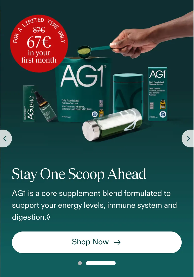
Above the fold on the phone the thumb sees only the green AG1 logo, a cart icon, a hamburger, and a full-width image hero with left/right chevrons, a swipe carousel. There's no add-to-cart, no price, no "Try AG1 Now" on screen one. The €87→€67 "Get started with AG1 today" box doesn't appear until roughly a quarter of the way down a ~16,000px page.
Fix: This is the only buy surface a phone user gets, and the single strongest asset is parked below thousands of pixels of decorative slider. I'd drop a condensed offer summary and the real price straight into the hero, in thumb reach, so a first-time visitor knows the deal exists before they even swipe a carousel that can't add to cart anyway.
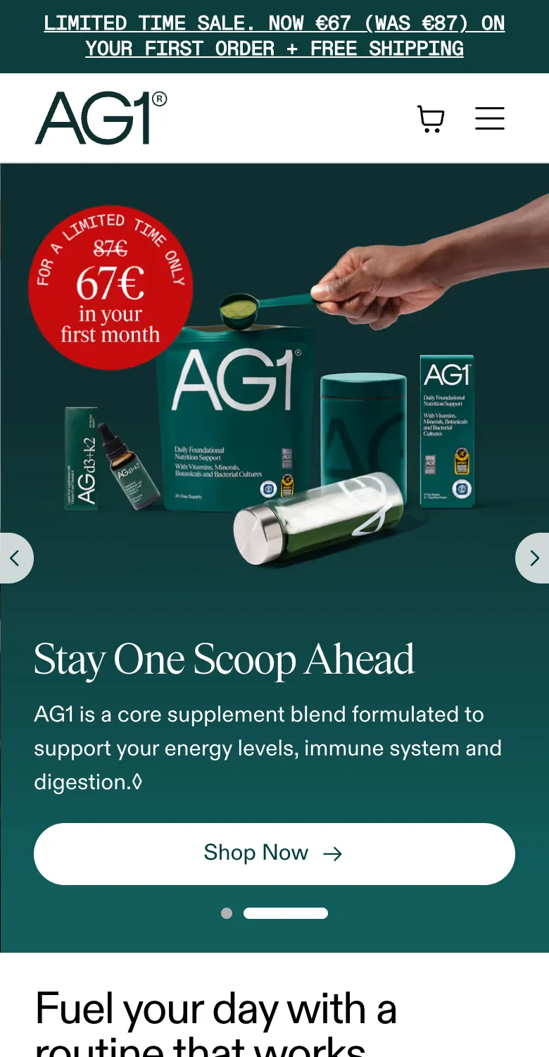
The sticky top bar reads "LIMITED TIME SALE. NOW €67 (WAS €87) ON YOUR FIRST ORDER + FREE SHIPPING", but it's a permanent banner with no countdown and no scarcity quantity, and the identical wording sits above the fold on every screen.
Fix: A permanent "limited time" on the most prominent mobile bar trains repeat visitors to tune it out. I'd either attach a real resetting timer or reframe the bar around the concrete stacked value ("First order: free Welcome Kit + D3K2 + Travel Packs, €20 off") so the urgency claim stays believable on a small screen.
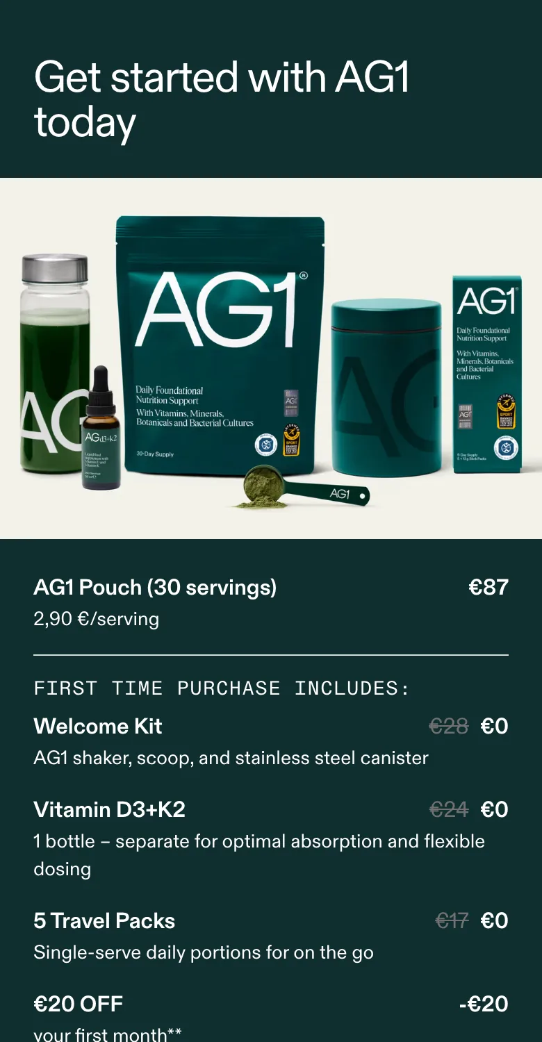
The "Get started with AG1 today" box lists "AG1 Pouch (30 servings) €87 / 2,90 €/serving", then stacks Welcome Kit €28→€0, Vitamin D3+K2 €24→€0, 5 Travel Packs €17→€0, €20 OFF -€20, Total €87→€67, under one "Try AG1 Now →" button. On mobile there's no quantity selector, no one-time-vs-subscribe toggle, no longer-term option: the only path is one pouch on subscription.
Fix: The single buy box gives a high-intent phone buyer no way to commit harder. I'd add an explicit subscribe-and-save vs one-time choice plus a quantity or prepaid-term option, so a customer who wants more can tap it in place instead of being capped at one pouch on one screen.
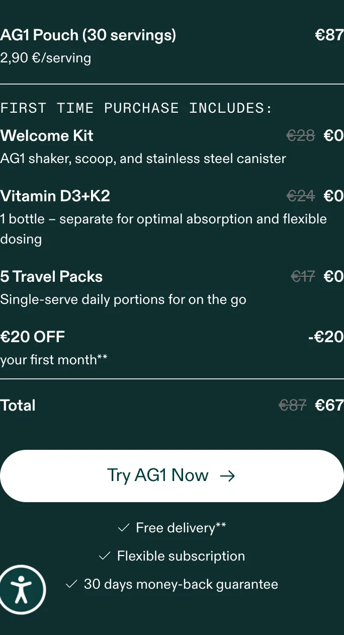
"Try AG1 Now →" is the page's only buy button and it lives partway down the page inside the offer box. Nothing sticky follows the thumb. To act from the testimonial carousel, expert row, UGC or FAQ bands lower down, a phone visitor has to scroll all the way back up to this one button.
Fix: On a buy surface this long, intent gets captured by the lower-funnel proof and then stranded from action. I'd add a sticky mobile add-to-order bar showing "AG1 first order €67 · Try AG1 Now" once the offer box scrolls out of view, keeping the tap target in thumb reach through the whole scroll.
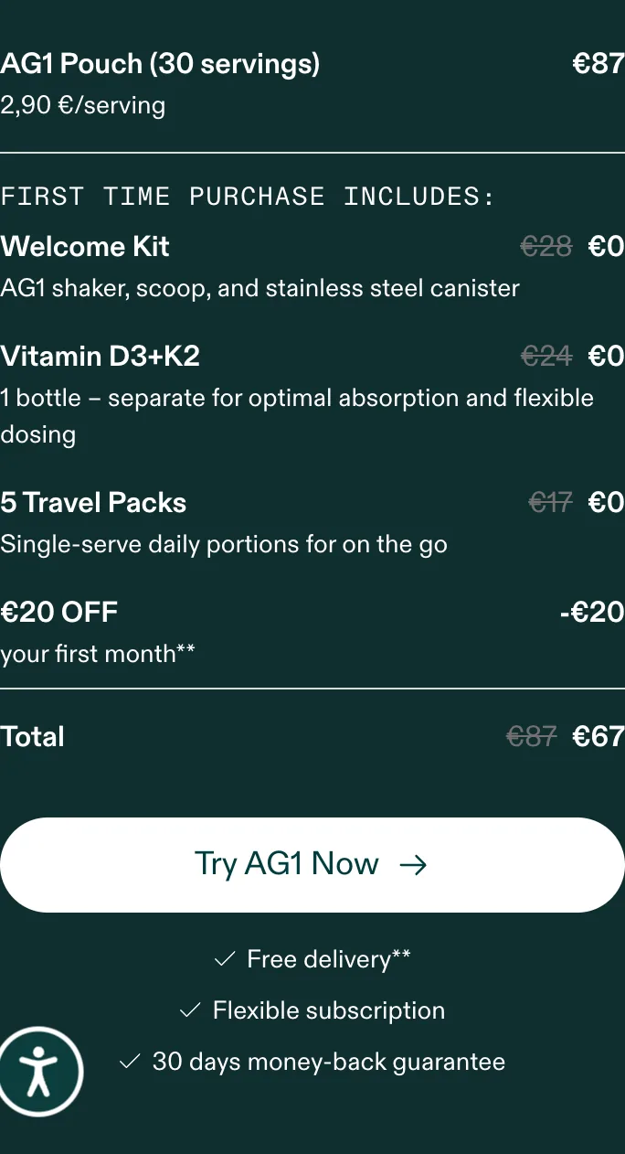
Under "Try AG1 Now →" the only reassurance is three items: "✓ Free delivery** · ✓ Flexible subscription · ✓ 30 days money-back guarantee". The box shows "€67" and a footnoted "first month**" line; the actual €87/month renewal price only lives in footer legal copy, far below the fold and away from the decision.
Fix: Burying the renewal price in a footnote on mobile (where the footer is a long scroll away) creates a trust gap and post-first-order churn. I'd put a plain-language summary right under the button: "€67 first month, then €87/mo, skip or cancel anytime", so the commitment is clear at the moment of the tap, not discovered after subscribing.
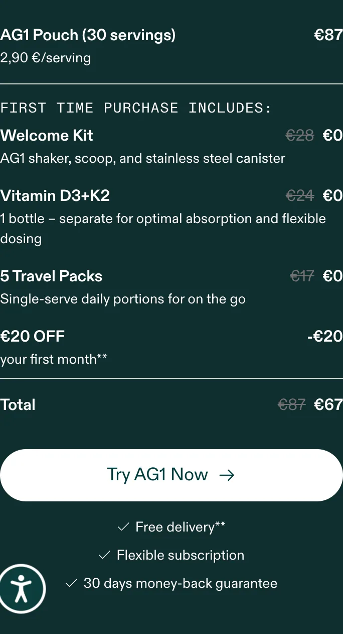
"Flexible subscription" appears as two words in the microcopy row but is never expanded into the actual skip / pause / cancel mechanics anywhere on the mobile buy surface; the asterisks point to fine print rather than spelling it out inline.
Fix: Flexibility is the biggest objection to an €87/month commitment and right now it's two vague words on a small screen. I'd spell it out inline next to the CTA ("Pause, skip a delivery, or cancel in one tap. No fees") so the promise is believable in thumb reach at the decision point.
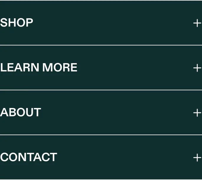
The mobile offer box gives away Vitamin D3+K2 (worth €24) and 5 Travel Packs (worth €17) free inside the first order, proving these complementary SKUs exist and are attach-ready. But they only ever appear as freebies: there's no point in the funnel to add an extra D3+K2 bottle, more Travel Packs, or a second pouch as a paid item, and the cart surfaces none of them.
Fix: AG1 already manufactures attach-ready SKUs and only uses them as giveaways. I'd offer them as paid order bumps at purchase and as a one-click post-purchase upsell on the confirmation step (no checkout editing required) so the same products that justify the bundle also lift AOV. Validate any bump discount against margin before it goes permanent.

Proof is spread across separate mobile bands: "15 years of research in every scoop" with Microbiome / Nutrient levels / Bioavailability tabs, a "Recommended by athletes, experts and high-performers" testimonial carousel (Hugh Jackman quote), "AG1 is trusted by experts" (Dr. Victoria Nicholas, Georg Abel PhD), and "Built on research, lived by real people" UGC (Florian). None of it sits beside the offer box or the "Try AG1 Now" button.
Fix: There's a lot of credible proof doing nothing for the decision on a phone, where each band is a separate scroll. I'd pull a concise aggregate rating plus review count up next to "Try AG1 Now →" and place one expert or celebrity line adjacent to the price, so the proof actively supports the tap instead of living in distant scroll bands.
The certification badges sit as a tall vertical column directly below the offer box ("PRODUCT OF / Commitment to a Clean Sport" (Cologne List), "INFORMED SPORT — WE TEST · YOU TRUST", "Men's Health LAB APPROVED 2025", "INDY/BEST BUY INDEPENDENT") each stacked one per row, low-contrast, adding real scroll length without reinforcing the price.
Fix: Strong endorsements diluted into a long, faint badge stack that pushes everything else further down the phone. I'd consolidate them into a single compact trust strip near the CTA, so the quantified proof reinforces the purchase rather than reading as a tall decorative column below the box.
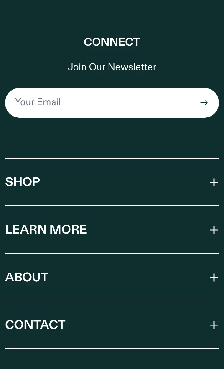
The mobile footer collapses into "CONNECT / Join Our Newsletter" with an email field, plus accordion columns "SHOP" and "LEARN MORE" (which expose "Refer Friends" and "AG1 Reviews") and a Trustpilot "Great" widget. None of these surface on the buy surface, in the empty cart, or near the offer box: they live at the very bottom of the ~16,000px page.
Fix: AG1 has a referral program, a review hub and a newsletter capture already built, and on mobile none of them fire at a moment of momentum. I'd promote "Refer Friends" as a post-purchase or account hook, route satisfied buyers into the review module, and surface the newsletter capture earlier, turning buried footer accordion links into a measurable acquisition and proof loop.
Product page

The captured mobile PDP is byte-identical to the homepage: same announcement bar, same nav, same carousel hero, same offer box. There's no separate product page; product detail is split into a "View Supplement Facts" link and the Microbiome / Nutrient levels / Bioavailability content tabs higher up.
Fix: Collapsing the PDP into the homepage leaves a high-intent phone buyer (the one who wants to scrutinise ingredients, dosing and reviews before an €87/month commitment) with no consolidated decision screen. I'd build a true product page that co-locates the offer, full supplement facts, the aggregate review module and the FAQ, so consideration and conversion happen in one mobile scroll.
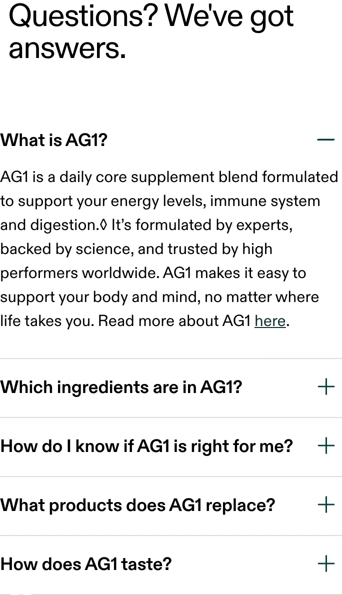
The FAQ block "Questions? We've got answers" sits far down the mobile page: collapsed accordion rows "What is AG1?", "Which ingredients are in AG1?", "How do I know if AG1 is right for me?", "What products does AG1 replace?", "How does AG1 taste?", after all the proof bands, with no CTA anywhere near it.
Fix: The FAQ answers the exact objections that block purchase (taste, fit, what it replaces) but on mobile there's no buy button within reach of it. I'd surface the highest-objection answers near the offer box and repeat a CTA directly under the FAQ, so a resolved objection can convert in place rather than forcing a long scroll back up.
Cart drawer
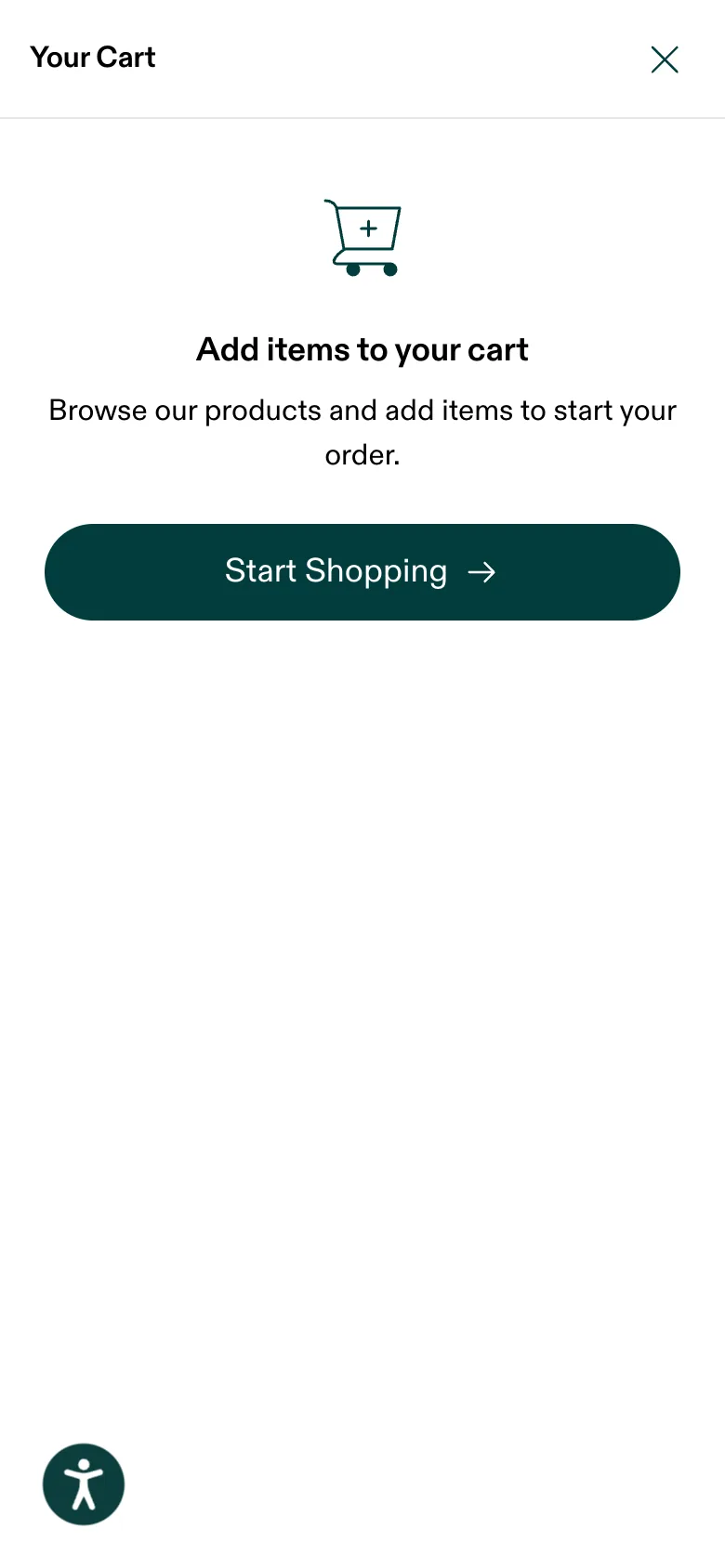
AG1 is headless with no standard Shopify cart; tapping the cart icon slides out a "Your Cart" drawer. Its empty state shows only a cart icon, "Add items to your cart", the line "Browse our products and add items to start your order", and one "Start Shopping" button: zero product recommendations, no recap of the €67 stack, no offer reminder.
Fix: That full-screen mobile drawer is a high-attention panel doing nothing. Even on a single-product funnel I'd fill the empty state with the first-order bundle recap and one relevant suggestion (an extra D3+K2 bottle, more Travel Packs) so a thumb that opened the cart out of intent gets a reason to continue instead of a "Start Shopping" reset.
Despite the sitewide "+ FREE SHIPPING" promise in the announcement bar, the mobile cart drawer carries no free-shipping progress bar and no goal cue; once the offer is in, the drawer holds a fixed bundle with no observed in-cart add-on, upgrade or cross-sell.
Fix: The offer stack proves AG1 can merchandise, but the live mobile cart never gets to. I'd add a single in-drawer add-on once the offer is in (a paid extra D3+K2 or a Travel Pack multipack framed as added value) plus a simple goal cue, so the cart earns a unit instead of sitting static. Validate any add-on discount against your margins. A % off cuts net revenue on that SKU; test the take-rate before making it permanent.
Screens

What I'd fix
- 1Lift the recurring terms and the flexibility mechanics out of the footnote and set them right under "Try AG1 Now" on the phone: "€67 first month, then €87/mo, pause or cancel in one tap", so a thumb-scroller never discovers the real price after subscribing.
- 2Add a sticky mobile add-to-order bar that surfaces once the offer box scrolls past, so intent captured by the proof bands lower down converts in-thumb instead of forcing a scroll back to the single buy button.
- 3Build one compact trust strip beside the offer (Trustpilot rating, 3,000+ surveyed customers, the lab-approval badges) instead of stacking them as a tall faint column below the box and scattering the rest across four scroll bands.
- 1Sell the D3+K2 bottle and the Travel Packs as paid order bumps at purchase and as a one-click post-purchase offer. Today they only ever appear as first-order freebies, never as a way to spend more.
- 2Replace the dead-end empty cart drawer with a first-order value recap, one relevant add-on, and a free-shipping cue, turning a blank mobile panel into a step that reinforces the bundle.
- 3Give the single-SKU offer box a quantity or longer prepaid-term choice so a high-intent phone buyer who wants more can commit on the spot instead of being capped at one pouch.
Want this fixed on your store?