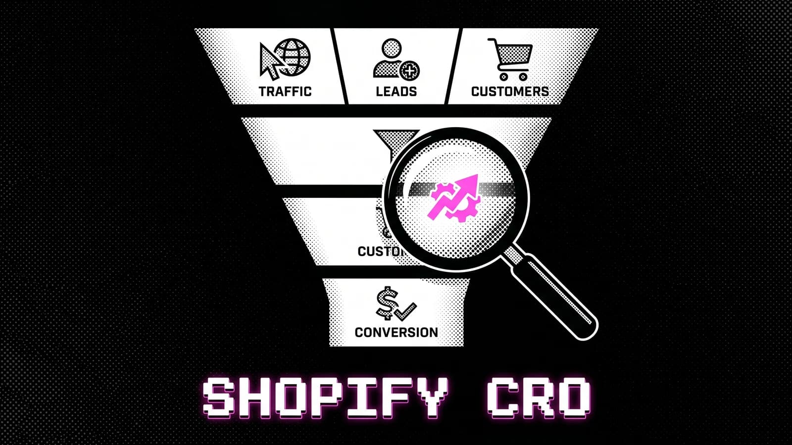
Most Shopify stores under $500k/month don't have a traffic problem. They have a conversion problem.
The instinct when revenue stalls is to buy more traffic. More Meta spend, more Google Shopping, more creative. But more traffic just multiplies the conversion rate you already have, leaks included. If the store converts at 1.4%, doubling traffic doubles the 1.4%. The cheaper move is to fix what happens after the click.
That's what Shopify conversion rate optimization is. This guide is the complete version. What it actually is, what a good rate looks like in 2026, how much traffic you need before a test means anything, and the order to fix things.
TL;DR
- Conversion optimization is diagnostic work, not a checklist of tactics.
- The Shopify platform average is around 1.4%; above average starts near 2.0%. Your own baseline trend matters more than either.
- Most stores don't have the traffic to A/B test single elements. Know the floor before you start.
- The product page and checkout are where conversion is won or lost. Start there.
- Revenue per visitor (conversion rate × average order value) is the metric that replaces conversion rate once both halves work.
- Conversion is one layer of ecommerce optimization; speed, order value, retention and findability are the others.
What Shopify conversion rate optimization actually is
Shopify conversion rate optimization is the discipline of converting more of your existing traffic into buyers by fixing the buying journey. It's diagnostic work. You find where the structure leaks intent, change that structure, and measure the change against a control.
Not a checklist. Not button colours. Not a redesign by default. Those are the things people call CRO when they don't have a diagnosis.
The distinction changes what you do on Monday. A checklist tells you what's theoretically true for all stores: add trust badges, use good images, make the CTA contrast. Useful starting points, but they're not an audit. An audit tells you what's wrong with your store specifically, in priority order. For the full picture, what a CRO audit actually covers goes deeper than I can here.
It also isn't a one-time fix. It's a loop: audit, design, implement, measure, iterate. The stores that compound keep the loop running instead of treating conversion as a project with an end date.
What a good Shopify conversion rate is in 2026
The Shopify platform average sits at roughly 1.4%. "Good" starts around 2.0%, the top 20% of stores reach 3.1–3.5%, and the top 10% reach 4.7–5.2% (easyappsecom, Shopify Conversion Rate Benchmarks, updated March 2026).
| Tier | Conversion rate |
|---|---|
| Platform average | ~1.4% |
| Above average | 2.0%+ |
| Top 20% | 3.1–3.5% |
| Top 10% | 4.7–5.2% |
Here's the part most guides skip: the published benchmarks don't agree with each other, and it isn't close. The Shopify-specific dataset above puts the platform average near 1.4%. A global ecommerce dataset published in July 2026 puts the average mobile conversion at about 2.9% and desktop at 3.9% (skailama, mobile ecommerce conversion, July 2026). Those are not small differences.
They disagree because they measure different store populations with different methods, and almost none of them say so out loud. One is Shopify stores; the other is all ecommerce. If a guide quotes a single industry average as settled fact without naming its source and its sample, it's guessing with a decimal point. Check what any benchmark actually measured before you compare yourself to it.
Category moves the number as much as anything. One dataset covering 25+ industries and more than 10,000 Shopify stores puts Food & Beverage near 4.2% and B2B/Wholesale near 0.7% (easyappsecom, updated March 2026). That's a sixfold spread. A 2% rate can be strong in one category and weak in another. Price point and device mix move it too. A $300 product converts lower than a $30 one.
The honest framing: stop chasing "good." Chase your own baseline moving up. A store going from 1.6% to 2.1% just added 31% more revenue at the same traffic. That delta beats matching a benchmark you didn't set.
Why your conversion rate plateaued (and it isn't traffic)
Most stores plateau at 1.4–2% and blame traffic quality. It's almost never the traffic. The plateau is structural.
When I ask owners what they've tried, the answer is usually the same list: changed the hero image, updated the button colour, tried a popup. Nothing moved. Those are surface changes on a structural problem, and most of them come off a best-practice list. Which ones hold up and which ones I would argue against is in conversion rate optimization best practices. The product page hierarchy is wrong, the trust signals sit nowhere near the decision, the price isn't justified, or the cart leaks at the threshold. No button colour survives that.
The pattern across 90+ Shopify projects: the highest-impact fixes are almost always structural, and they're almost never the thing the owner was about to change. The full argument is in why your Shopify conversion rate is stuck.
Do you have enough traffic to test?
Most stores reading this cannot run a meaningful A/B test, and nobody tells them. The working floor is roughly 200–250 conversions and about 5,000 sessions per variation, and more for split tests. Below 200 conversions per variant, tests rarely produce trustworthy winners. Big observed lifts at low volume are usually noise wearing a result's clothes.
Do the arithmetic against your own store before you install a testing tool. Two variants at 250 conversions each is 500 conversions inside the test window. A store doing 200 orders a month needs two and a half months of clean traffic to get there, assuming nothing else changes. Nothing else stays the same for two and a half months.
So the branch is:
- Below the floor. Don't test single elements. Rebuild the structure instead, measure against a clean before-and-after with a stable baseline, and accept that you're trading statistical certainty for speed. That's the honest trade, and for most stores it's the right one.
- At the floor. Test one hypothesis at a time on your highest-traffic surface. Every visitor sees the header on every page, which makes it the highest-leverage surface in the store. I've run roughly 15 separate tests on a single header bar for one supplements brand, and that's not excessive. It's what having one high-traffic surface lets you do.
- Above the floor. Test continuously, but still one change at a time, and read the segments apart.
One caution on that floor, because it's the trap I fell into myself. Those numbers are the minimum to detect a big difference. Spotting a small one, a few percent either way, needs far more volume than most stores will ever have. If your hypothesis is "this might be slightly better," you can't test it. Test things you think will move the number a lot.
One more rule that matters more than sample size: pick the winner on profit, acceptance rate, revenue per visitor, or margin-adjusted order value. Never on raw sales. A variant that sells more units at a worse margin is a loss that looks like a win on the dashboard.
Where conversion actually leaks: the layers
A Shopify buying journey leaks in a small number of predictable places. Across the work, the same layers come up in roughly this priority order:
- Product page hierarchy. The information a buyer needs to decide is buried. Reviews below the fold, price too quiet, social proof nowhere near the CTA.
- Trust signals. Missing, or placed where nobody is making a decision.
- Price justification. The page states a price but never earns it.
- Cart threshold. The cart leaks at the moment the buyer evaluates the total.
- Checkout friction. Too many fields, too few payment methods, surprise costs.
- Mobile experience. Treated as a shrink of desktop instead of its own design.
- Copy. Features-first instead of benefits-first.
There's a sequencing rule underneath that list, and it's the thing most tactic roundups miss. The Baseline Framework™ treats the homepage as roughly 80% trust and 20% selling, and the product page as the inverse: 80% selling, 20% trust. Early in the journey people need reassurance more than a pitch. Once they're interested, they need the decision made easy. Put selling pressure on a homepage and it reads as pushy. Put reassurance where the decision happens and it reads as hesitation.
The nine causes I find most often, with fixes, are in why your Shopify store isn't converting.
The product page is where decisions happen
The product page is the single most important surface in the store. It's where the buy decision is actually made, so a structural fix there moves the number more than a fix anywhere else.
The correct above-fold hierarchy on mobile, where most traffic lands, puts the product name, price, a trust cue, and the add-to-cart inside the first screen. Reviews and benefit-led copy follow in the order a buyer evaluates them. Most stores invert this. They lead with brand story and bury the decision-making information.
One change earns its place more often than anything else I test here. Three benefit bullets per product card, delivered through Shopify metafields, has produced a 10–20% conversion lift across multiple stores. It's the most repeated tested result in my corpus. It works because it moves the buyer's evaluation criteria up the page, before they have to decide whether to keep scrolling.
That's also the caveat worth stating: it's repeatable, not universal. It works when the products need explanation. On a category where the product explains itself in a photograph, the gain is smaller.
The product page is also where conversion work and monetization work overlap. The same page that converts better can carry bundles and quantity breaks that raise order value. That overlap is the architecture behind the Invisible Second Sale™.
Checkout: the most fixable number
Checkout conversion is the most fixable number in the funnel. Unlike acquisition conversion, which depends on traffic quality and dozens of variables, checkout abandonment comes from a short, well-understood list of friction points. Fix them and the number moves.
The usual killers are surprise shipping costs, too many form fields, missing express payment options, and forced account creation. Mobile makes each one worse. Mobile cart abandonment sat near 77% in 2025 (skailama, mobile ecommerce conversion, July 2026). The full diagnosis is in Shopify checkout conversion rate.
The August 2026 checkout deadline that breaks conversion tracking
If you're on a non-Plus plan and you've ever pasted code into Additional Scripts, this is the most urgent thing in this guide.
Checkout Extensibility replaces checkout.liquid, Additional Scripts and Shopify Scripts. Shopify Scripts stopped working on 30 June 2026. The wider migration deadline for non-Plus stores is 26 August 2026. Custom tracking pixels, GTM containers and affiliate scripts pasted into Additional Scripts are removed, not migrated.
The failure mode is nastier than a broken page, because nothing visibly breaks. Google Ads conversion tracking goes silent. Smart Bidding starts optimising against zero-value events. ROAS collapses within a couple of days, and the ad account shows no obvious cause. You're left debugging your creative while the tracking is the problem.
Check your Additional Scripts field before the deadline, not after. If anything is in it, it needs a home in the new sandboxed tools.
Mobile conversion: where the gap lives
Mobile carries most of the traffic in nearly every store I audit, and it converts below desktop in nearly every one of them. Pull your own split before you accept anyone's benchmark. Shopify Analytics gives you sessions and conversion by device in two clicks. Your own numbers are the only ones that matter here.
That gap is the single biggest opportunity in most stores, because the traffic is already there.
The reason it exists is design. The desktop layout gets shrunk to fit a phone instead of being designed for one. Every tap is taxed, the add-to-cart competes with a sticky bar, and the first screen tries to do too much.
The gap closes where stores adopt one-tap payment and mobile-first checkout. If your mobile conversion is more than half below desktop, that's where the recoverable revenue is.
Revenue per visitor: the metric that replaces conversion rate
Once conversion is working, conversion rate stops being the right scoreboard. Revenue per visitor does the job better. It's conversion rate multiplied by average order value, so it captures both halves of what a visit is worth.
You can lift revenue without lifting conversion at all, by raising what each buyer spends. A store at 2% and $60 average order value earns about the same per visitor as one at 1.7% and $70. Optimization raises the first number. Monetization architecture raises the second. Revenue per visitor is where they meet.
That's why I treat conversion and order value as two halves of one job. The monetization half lives in the Shopify average order value playbook.
How to actually run conversion optimization
It's a loop, not a launch. The version I run with clients has five stages: audit, design, implement, measure, iterate.
- Audit. Diagnose the structural leaks in priority order. Output is a ranked list, not a checklist.
- Design. Redesign the leaking layer around how buyers evaluate, not around brand preference.
- Implement. Ship cleanly, with tracking in place before it goes live.
- Measure. Compare against a control. One change at a time when traffic allows.
- Iterate. Feed the result back into the next audit.
A test that didn't work
Here's a test that cost two weeks and proved nothing.
A fresh-food brand doing about €320,000 a month, header benefits section. We'd already won on that surface once, so the hypothesis was reasonable: if one header change moved the number, a second should too.
It ran two weeks across roughly 30,000 visitors, about 600 orders per arm. Control finished at €1.356 revenue per visitor and 4.04% conversion. The variant finished at €1.298 and 3.87%.
That's 4.3% worse. The test itself only touched a slice of traffic, so the loss inside the window was small. What matters is the rollout. On a store at €320,000 a month, a 4.3% drop in revenue per visitor is about €13,760 a month.
Read that carefully, because the €13,760 is a projection, not a measurement. The test never cleanly separated from control.
Here's the part that stings. 600 conversions per arm clears the minimum floor I gave you above. It still wasn't remotely enough. That floor is for detecting large differences. Detecting a 4.3% relative gap on a 4% baseline needs somewhere around 8,000 conversions per arm, not 600. We were short by more than tenfold, which means a 4.3% reading is a coin landing tails a few more times than heads.
The correct conclusion was the boring one. Control stays. We don't know why the variant lost, and the honest range on that €13,760 is wide.
Two things that test bought:
It stopped a change that would have shipped. The variant looked better in review. Without the test it would have gone live on the strength of an opinion, at a plausible cost of five figures a month. That's the case for testing in one line: the win here wasn't a lift, it was a loss that never happened.
It exposed how much the first win was worth. One win on a surface doesn't make the surface a reliable lever. The header is the highest-leverage place to test because every visitor sees it on every page. That cuts both ways.
There's a third category worth naming, because it's the one nobody writes about: results that were real and unprovable. A sea moss and shilajit brand went viral on TikTok and a change I made lifted add-to-cart clicks by about 50%. The store was in a sales downtrend with poor tracking, so the revenue impact was invisible. The lift happened. I can't show you what it earned.
I'll be straight about my corpus here. Across 572 documented rationale cards, the work is heavy on testing methodology and light on reported outcomes. Two full batches contain no completed test result at all. Most entries read "worth testing" rather than "tested, here's the number." That's a real gap. It's also the honest shape of this work: most of it is judgment under uncertainty, and the discipline is saying so.
The mistakes that waste the most budget
Most wasted effort comes from process mistakes, not from picking the wrong button colour.
- Optimizing the surface before the structure. Swapping hero images on a page whose hierarchy is broken. The structural problem outlasts every cosmetic change.
- Changing five things at once. When the number moves you can't tell which change did it, so you learn nothing.
- Reading sitewide conversion only. A change that helps desktop and hurts mobile nets to flat. The loss hides in the blend.
- Testing without the traffic for significance. Covered above. It's the most common and most expensive.
- Calling a good week a win. Without a control you credit the redesign for what seasonality caused.
- Picking winners on raw sales. More units at a worse margin is a loss with a green arrow next to it.
Where I've been wrong
A longevity supplement client had a benefits section built around a stock-looking image. I proposed replacing it with something cleaner and more considered. I was confident about it.
The client pushed back with three specifics. My version hid the descriptor text behind the section titles, so you had to work to read what each benefit actually was. It killed an ingredient animation that was doing real work, because that animation was what made the claim believable rather than stated. And on a phone, the whole thing was harder to read than what they already had.
They were right on all three. Their version stayed.
What I took from it: "cleaner" is not a goal. It's a preference that sometimes coincides with better and sometimes doesn't. The animation looked like decoration to me. It functioned as evidence to their buyers. I only found that out because the client knew their product better than I did. I now ask what a section is doing before I propose making it tidier.
I lose arguments like this a few times a year. The ones worth recording are the ones where the client had context I didn't, rather than the ones where we simply disagreed on taste.
How to know it's actually working
Shopify conversion rate optimization without measurement is redecorating. Decide what number, and over what window, before you ship anything.
Sitewide conversion is too blunt. It blends devices, traffic sources, and page types that behave nothing alike. Segment it:
- By device. Mobile and desktop convert differently and break differently.
- By traffic source. Paid, organic, and email arrive with different intent. If email is the weak column, the gap is usually unbuilt flows rather than the platform, which is the argument I make in Klaviyo vs Omnisend vs Shopify Email.
- By landing page type. Homepage, collection, and product entries have different jobs.
- By new versus returning. Returning buyers forgive friction that new buyers abandon over.
Then match the metric to the change. A checkout fix is measured on checkout completion, not sitewide conversion. A product page change is measured on add-to-cart rate and progression to checkout.
Segmentation also protects you from your own assumptions. On a subscription brand, heatmap and research data showed only about 9% of shoppers clicking the buy-once option. The obvious read is to bury it. The conclusion was the opposite: keep buy-once as the default, because the people who need it are the first-time buyers you can't afford to lose.
The discipline that separates real work from guesswork is the control. A change measured against nothing is a story.
The order of operations: where to start
Shopify conversion rate optimization has an order to it, and the order is structural rather than enthusiastic. Don't install everything next week.
| Revenue band | Start here | Why |
|---|---|---|
| Under $50k/month | Structural rebuild | You can't reach significance on single elements at this volume |
| $50k–$500k/month | Fix the rate, then order value | Both halves compound; sequence matters |
| $500k–$5M+/month | Ongoing optimization loop | Compounding comes from iteration, not one fix |
If the buying journey is unclear or the product page doesn't sell, start with the structural foundation. The Baseline Conversion Blueprint™ is a strategy and design intensive that gives the store a clearer structure before development.
Frequently asked questions
What is Shopify conversion rate optimization?
It's the discipline of converting more of the traffic a store already has into buyers by fixing the buying journey. It's diagnostic, not cosmetic. The work is finding where the structure leaks intent, changing it, and measuring against a control, not swapping button colours and hoping.
What is a good Shopify conversion rate in 2026?
The Shopify platform average is roughly 1.4%. Above average starts near 2.0%, the top 20% reach 3.1–3.5%, and the top 10% reach 4.7–5.2%. But "good" depends on category, price and device mix, and published benchmarks disagree sharply. Chase your own baseline moving up.
Why is my Shopify conversion rate low?
Low conversion is almost always structural, not surface. The product page hierarchy is broken, trust signals sit nowhere near the decision, the price isn't justified, the cart leaks, or mobile is an afterthought. It's rarely the hero image. Diagnose the leaking layer first.
How much traffic do I need before A/B testing is worth it?
Roughly 200–250 conversions and about 5,000 sessions per variation, and more for split tests. Below 200 conversions per variant, tests rarely produce trustworthy winners. Under that floor, rebuild the structure instead of testing single elements.
How long before conversion optimization shows results?
A structural rebuild shows up within a reporting cycle or two, because the change is large. A single test needs enough traffic to reach significance first, which for most stores under $50k a month means weeks. Set the window before you ship, and hold it.
Is conversion optimization worth it for a store under $50k a month?
Yes, but not as testing. At that volume you can't reach significance on single elements in a sensible window. The work is structural: fix the buying journey, then start testing once the foundation converts and traffic supports it.
Is conversion optimization better than buying more traffic?
For most stores under $500k a month, yes. More traffic multiplies whatever conversion you already have, leaks included. Optimization raises the rate that traffic converts at, so every ad dollar works harder afterwards.
Should I run a test or redesign the store?
Test when you have the traffic to reach significance and a specific hypothesis. Redesign when the structure is broken enough that testing one element at a time would take years. Low-traffic stores usually need a structured rebuild first.
Key takeaways
- Shopify conversion rate optimization converts traffic you already paid for. More traffic just multiplies your current rate, leaks included.
- The platform average is around 1.4% and above average starts near 2.0%, but published benchmarks disagree sharply. Your own baseline trend matters more.
- Most stores are below the testing floor of ~200–250 conversions per variant. Below it, rebuild rather than test.
- The product page and checkout move the number most. Three benefit bullets per product card is the most repeatable win I have.
- A losing test is worth paying for. One two-week null result stopped a change that would have cost about €13,760 a month.
- Non-Plus stores face a checkout migration deadline that silently breaks conversion tracking. Check Additional Scripts now.
- Once conversion works, revenue per visitor becomes the scoreboard.
What to do next
No guaranteed lift. That wouldn't be honest. Your results depend on category, price, traffic quality, and what the buying journey looks like before the work starts.
What I can tell you is what sits behind the diagnostic. 20 years in web and design, 10+ years running conversion tests, 90+ Shopify projects.
If you want to know which layer is costing you conversions, book a free call and I'll help you find it.
No hype. No fake certainty. Just the discipline of turning the traffic you already have into more revenue.