- Published on:
Why custom ecommerce website design converts better
- Authors


- Name
- Darjan Hren
- @darjanhren
Lack of profitability is the number one reason most e-commerce businesses fail.
They just aren't spending that ad budget right or are losing sales because of UX/UI and even site speed performance.
I'm willing to bet that if you could change only one thing in your business, it would be to have higher conversion rates. This would mean you'd get more sales without increasing your ad spend increasing your profitability instantly.
Wouldn't it be amazing if you could get more sales without doing any extra marketing?
You're not alone on this, either. Even high revenue ecom stores are struggling. One of my clients had major problems with selling products and needed higher conversion fast or they'd have to close shop.
They've been investing a lot of time and resources to create quality products customers would love, got to create this amazing brand and the website had all the bells and whistles and a great tech stack.
But why were they still struggling to sell their products profitably and be able to provide security for their employees? It didn't make sense at all.
It seemed that their competition which had a smaller team of experts were making more money despite their superior product in the whole region.
Why were they still not making the kind of revenue they needed even though they were doing "everything" right?
- They shared their products to all major social media sites
- They used content marketing to post on their blog and other channels regularly
- They advertised on Facebook, Google and some other smaller networks
- They tried things with influencers
- They even tried to copy landing pages form others
But to no avail...
Below you'll discover how that company increasedtheir landing page conversion rate by 61% and achieved profitability with their online advertising that started their path to growth and not just saving their existence.
They went through a conversion focused re-design for their ecommerce site that started to move things into the right direction.
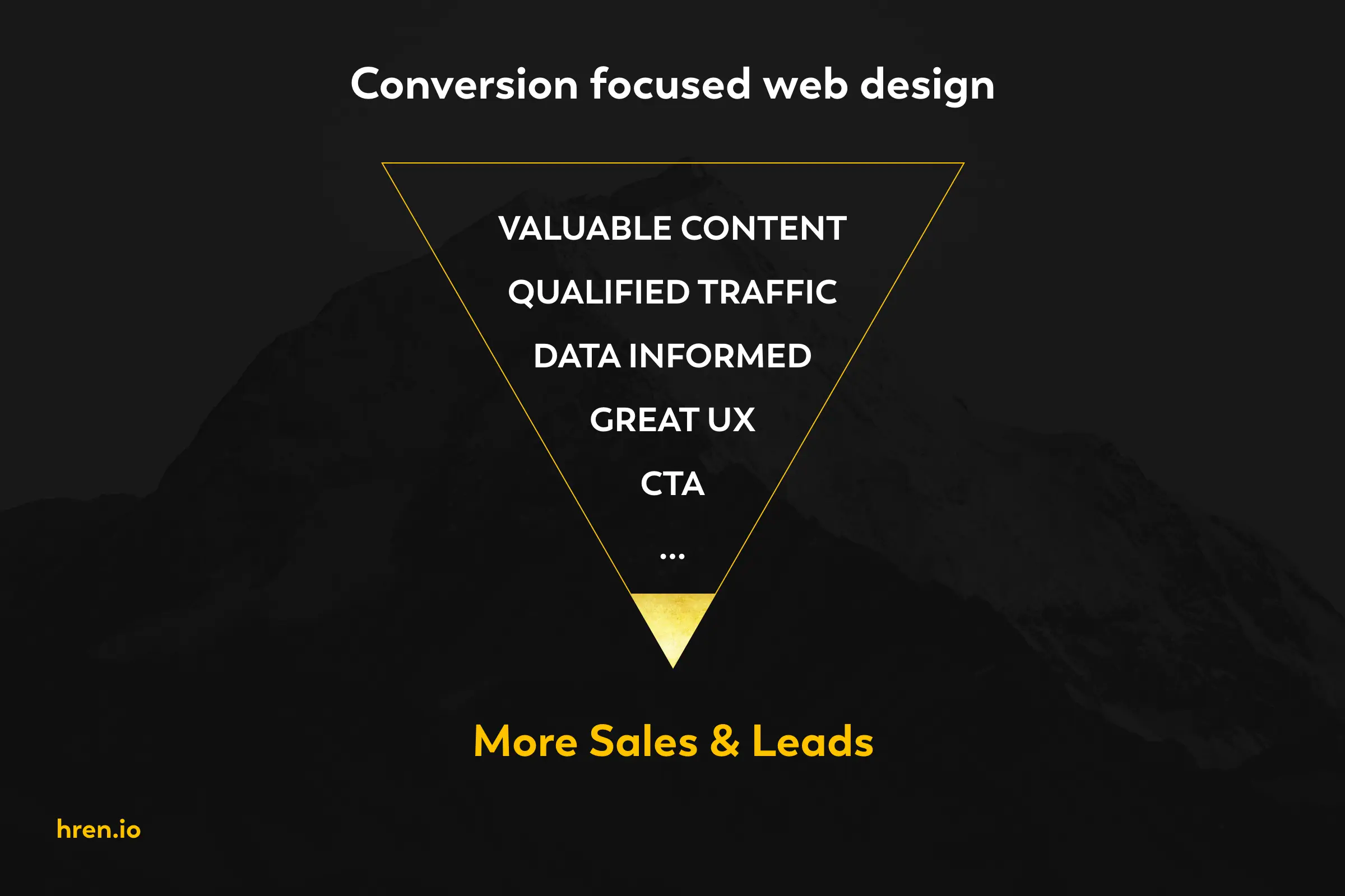
What is conversion-focused e-commerce web site design
When you're starting your online business selling products you'll probably find words like eCommerce, ecom, online store and notice platform names like Shopify, WooCommerce, Squarespace,...
Each website has its look & feel, a visual identity (logo, color palette, specific images,...) to show that digital brand presence visually.

Some topics that define conversion-focused-web-design
E-commerce websites are a bit different from regular sites as they mostly feature products and catalogues instead of content but should have both for marketing benefits.
Because of the goal of such a site is that the visitors achieve a specific goal which is to sell or sign up its design should help the visitors convert into a customer easier and faster.
Because of that conversion rate, optimized designs will make the store more money without increasing the ad spend or traffic.
What is conversion rate?
The best design is one that takes into consideration data, insight, research and expertise by using CX+UX+UI (customer experience, user experience and user interface design) methodology to help increase sales for the online business.
What things should be considered during ecommerce web design?
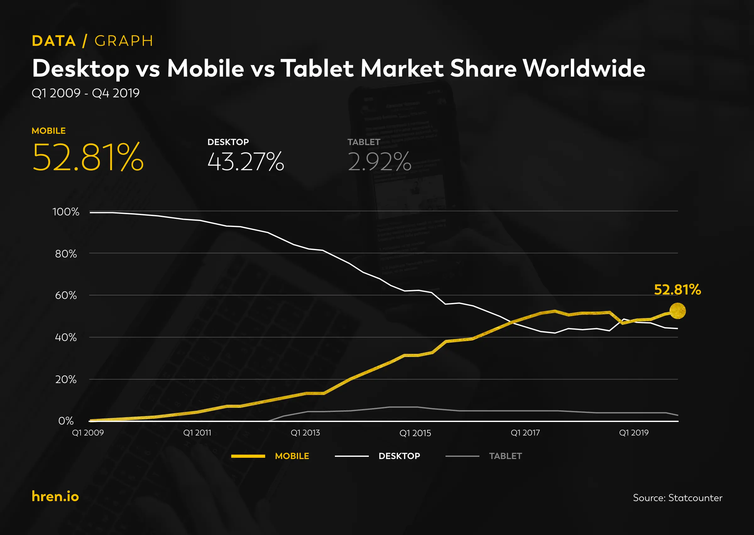
As more and more people use mobile to browse, shop and get the information it's become the perfect device to optimise for and start.
Traffic to sites average is more then 52.3% mobile visitors so focusing on the majority of users will get you better and bigger sales results. About 70% of sales for online stores happens on mobile phone as well. But it could be more, depending on the industry.

Source: Statista
Here's a top 6 list to consider:
Mobile first approach
Start to think mobile over desktop. The UX of mobile vs desktop is so different that not only clicking is not possible on mobiles, but the desktop doesn't allow for gestures, swiping,... What works for mobile may not work for desktop and vice versa so depending on the content you may need to design both cases to optimise for best conversion on both devices.
Responsive design
Instead of doing +5 different websites for each device (mobile, mobile landscape / tablet, tablet landscape / small, medium and large desktop), create one that can adapt visually to any device
Number of products
How big the e-commerce store is and how many categories of products will have impact the layout and best practices of the web site. 1-3 product stores can have a custom webpage for each product increasing conversion rates a lot more then if you'd have a default template for 300 products. Managing and maintaining a store is heavily dependent on the number of items it's selling.
Cart/Checkout
These two pages are the heart of any e-com website for the reason that anyone that makes a sale comes through here. It visitors bounce here and leave the site, you lost a sale so optimising these is extremely important and you want to have full control over it. Shopify sadly doesn't give you that control.
Search engine optimization
If you want to focus SEO as one of your marketing channels, you need to make a strategy for it while you plan the website and before build. Choosing a bad WooCommerce theme that's bloated not only will provide you lower ranking in search results, but you may need to redo the full site design and build as some tech stacks are limited. SEO has become quite technical so to fix these development bugs or site performance can be costly.
Data and Google Analytics
Not properly set up Analytics could mean that you'd think you're making money (maybe even for months) but you're actually losing it. (e.g. your pixel is firing twice and sending wrong data to analytics so inctead of 1 sale, you see 2).
Here's a quote from Tobias on this topic:
What will bite you later on - not having Google Analytics and Tag Manager properly set up (e.g. not tracking every step of the funnel from landing page to thank you page, and any other actions you want to track.
Tobias Pettigrew from tobiascopywriting.com
You can't make important decisions based on wrong data as anything you do will be wrong.
What is the most important thing of an e-commerce web design?
1. Speed of the website
Online shopping has become competitive so if a site takes +3 seconds to load, there's a high chance you just lost a sale as the visitor will close the tab and move to your competition. This is especially true on mobile as while browsing on-the-go we don't have too much time. Impulse buying is also strong on mobile but so are all the distractions so making sure the experience is snappy can make or break your store.
2. Site security
Having a strong SSL certificate is a must and a standard. Encrypting data for personal information and PCI compliance for payment information is crucial to your existence as if you want to sell anything, the user needs to trust you and feel safe before a purchase happens.
3. Cart/Checkout design
This step in your user journey needs to be highly optimised without friction and each step needs to be clear. Too many unnecessary fields, or hidden discount fields, unclear and confusing pricing with tax,... it all comes together on this step if you will make money or not. This is also one of the most impactful places to optimise for conversion as it impacts each sale and can mean you selling profitably or not.
4. eCommerce homepage design
If you're running ads, you probably don't send traffic here without a good reason. The homepage should be a hub about you, your brand, mission & vision and products. You want people to connect with you, get their trust and to know you more before taking the next step. Just like dating, so a great design layout is important.
5. Product pages
Give special care to these pages and make them custom for each product to get better results. If you have a lot of items in your store, design an optimised generic landing page but for your best selling products do a custom design. I've been consulting my clients with a landing/product page hybrid if they're running ads for it and it made them up to +70% more money.
6. Navigation
Not only for SEO purposes but for UX as well, the rule of 3 clicks to get to any content page is important. Design patterns for nav may be tricky if you're big, but using mega menu helps. Group pages together, structure and make a hierarchy of them. Prioritise per brand/emotion, products/selling and info/knowledge.
7. Always have your customers best interest and experience in mind
No matter what, cheap marketing tactics won't work (for long at least) and if you don't test things you may be even losing money without knowing. But if you're always honest with your customer and want to help them, you can never fail.
Why have an ecommerce website that sells more products
Since the global pandemic in 2020, brick & mortar and retail stores moved created a new wave of online presence as they started a ecommerce website to sell their goods or services even as a micro local company, they delivered the good by themselves via car of bike.
There's various reasons to own one but the most important one is that it has become one of the most succesful marketing channels that connects with a customer.
As these customers own a variety of devices (desktop, tablet or mobile) having a digital presence can cover all of them at once (with the help of responsive-design technique when programming a website).
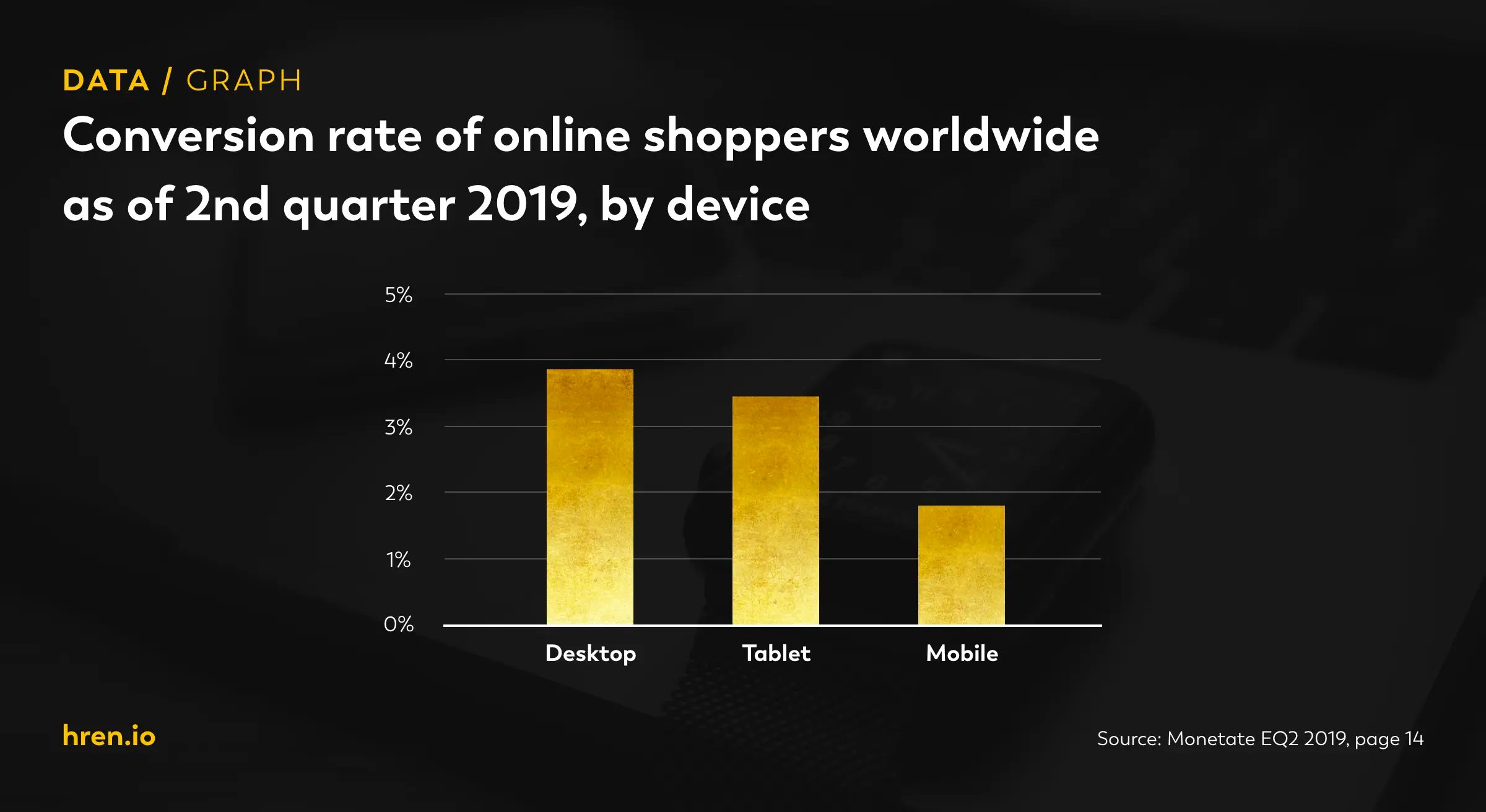
Data shows that mobile traffic is still growing but conversion rates are way lower then desktop as the UX/UI experience is so different. Mobile first optimization is a must in this case. There's a lot of other tips a deasign studio or consultant can share with you about best ecommerce practices.

Source: Monetate EQ2 2019, page 14
How much will an eCommerce website design service cost?
One of the hardest things to estimate is pricing e-commerce web page design projects as there is a large amount of information that needs to be processed.
Doing it right is important here and that takes time, there are not shortcuts here. Templates are cheap (about $100) but customising them and fitting them to work for your brand can cost you thousands of dollars and as it's usually not optimised for what you do you it may be the reason why you can't get your store to profitability. Cost you don't even know about is the worst.
Everything is connected and a cheap price for design is never a good signal for your business.
SmallMediumLargeCustom+25.000+100.000
How long does the web page design project take?
For a full service with all the needed steps to create high quality, here's an estimate breakdown of time for a medium sizes project:
TaskTimeDiscovery1-2 weeksResearch1 weekAnalysis1 weekWireframes2-3 weeksDesign3-6 weeksPrototype2 weeksTest1 weekProduction3-6 weeksTotal14-21 weeks
So a project can take anything from months 3 months (if everything goes ok) to 5 months or more. Some brands even do a full year for an eCommerce redesign of their stores.
It's a. good idea to priritize doin it right over doing it on time as you don't want to redo the whole process.
What are the benefits of having your eCommerce website designed by a professional web design agency versus using one of the templates offered by the different shopping cart platforms?
If you're starting, doing it on a platform for testing your business idea is a great way to jumpstart and find out product/market fit.
Best ecommerce platforms:
- Shopify (easiest, cheapest and fastest to start)
- Basic Shopify: $29/month
- Shopify: $79 month
- Advanced Shopify: $299 month
- Themes from 10
- WooCommerce / WordPress combo (more customisable, but may required more dev work)\
- Free but each additional plugin costs $$ to $$$, single or per year licences
- Themes from $20
- BigCommerce
- BigCommerce Standard: $29.95/month
- BigCommerce Plus: $79.95/month
- BigCommerce Pro: $299.95/month
- Amazon (great way to start selling without a store)
- they take a high two digit % of each sale
You can even use a ecommerce website builder for these platforms to make it easier, but they do have limitations and drawbacks.
Some platforms that seem good, but bring a ton of pain and problems with them are:
- Wix
- 3dCart
Most of the platforms make their business work and not yours, so you'Re limited. Shopify, for example, doesn't allow you to customise the cart/checkout pages which can be a huge loss in your sales. They don't use best practices as well so site speed and performance will limit you. I had clients shops that loaded in 44s!
When you have that, you'll probably start building your team and increase your visitors and revenue so you can hire an agency or professionals to get you to the next level.
Anything you do, you want ecommerce web design companies you work with to measure and think about conversion rate optimization. That is what moves the needle so start there.
A lot of e-com businesses make the mistake of doing redoing it all (new design, new tech stack,...) and then start a CRO program with a consultant, finding out that they need to redo or change what they did to make CRO or SEO work for them as it should.
Even if you're just hiring a design agency, they need to think conversion or have a data analyst on their team to shape the process.

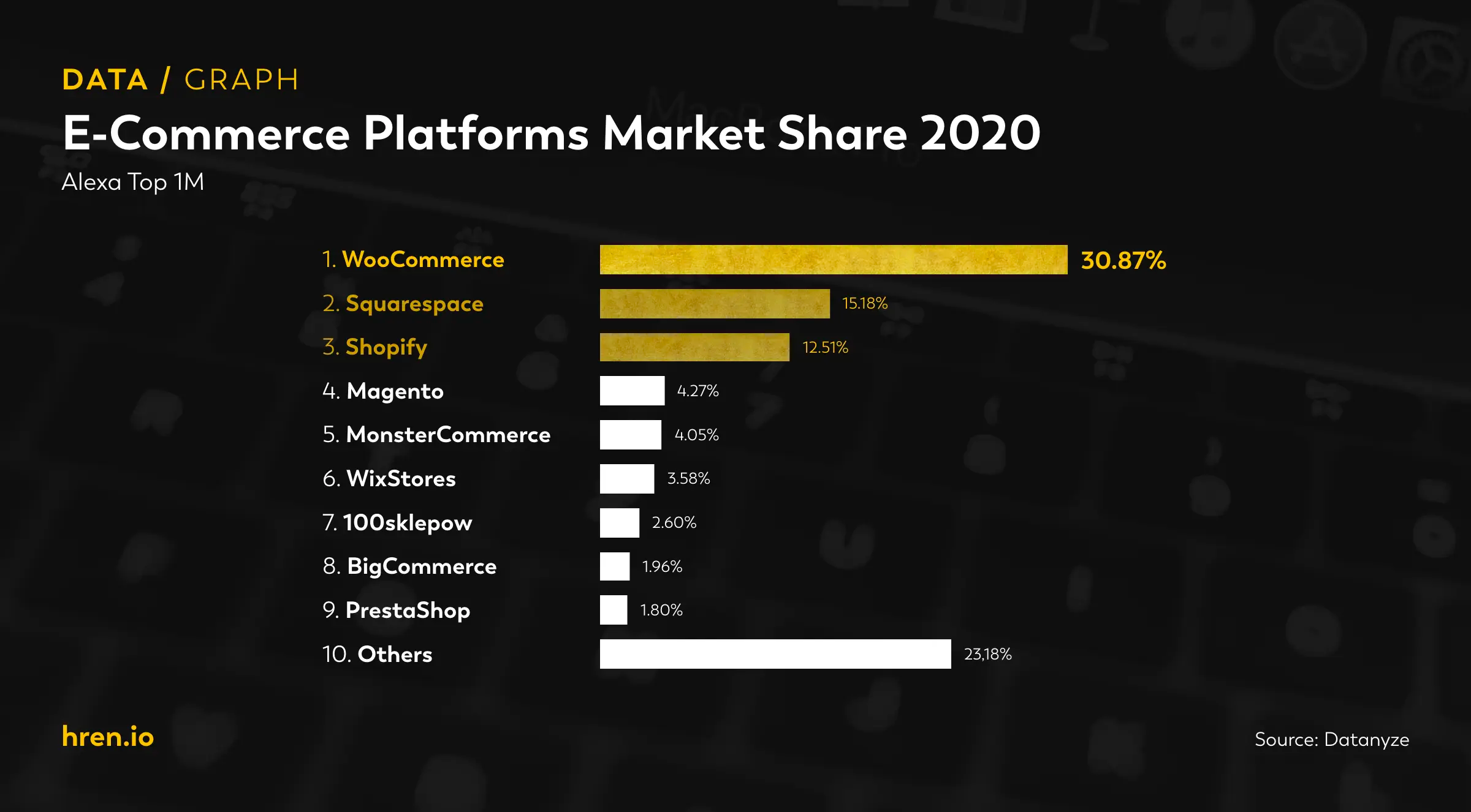
Source: Datanyze
E-commerce web designs inspiration
Here's a list of 6 beautiful page design sites that are a best example of what's possible. Great use of color, layout, typography, emotional copywriting,... things you make hard if you'd use templates.
Bite Toothpaste Bits
bitetoothpastebits.comNeuro Gum and Neuro Mints for Energy and Focus
getneuro.comGoodFish - Crispy Salmon Chips
goodfish.comSilver Oak Cabernet Sauvignon Wines
silveroak.comMurad Skincare | Clinical Skin Care Company
murad.comPrismatic Plants - Good Day & Good Night Adaptogenic Tinctures with CBD
prismaticplants.comHow do I start with ecommerce website designing?
You can do a couple of things. Hire a freelancer, design agency or studio or find specialized ecommerce website designers.
But you should start right away with a conversion optimisation consultant like myself that specialises in ecommerce design and brings results and revenue gains. I have +15 years website design with ecommerce experience and online marketing and have designed and helped grow multiple ecom brands from XX mil in revenue.
Conclusion & Takeaways
Ecommerce web design needs to convert for you in this online business world full of competition. And to be #1 you need to be better than everyone else and do bigger and better things.
If done right, a redesign of your ecommerce store that is data driven or inspired with a solid understanding of why is something, where it is, will have a great impact on your bottom line and growth.
And as we can now measure the impact, we can repeat this process over and over, keeping winning tests and improving the one that loses.
This is also a reason you want to hire a design professional that does great custom work, perfectly tailored for your brand.
Remember, design without function is just decoration and won't bring you results.
Liked the article?
Follow me on twitter to learn more about conversion optimization, design and ecommerce growth.