food & beverage · Teardown
Magic Spoon
This is a loved brand doing most things right: 80,000+ five-star reviews, a bundle builder, a subscribe-and-save offer, and a cart that actually cross-sells. Where it leaks is length and focus: a marathon PDP (8,514px on desktop, ~19,000px on mobile) with no sticky Add to Cart, two hero CTAs competing for the first click, benefit bands that repeat, and a cart cross-sell with no free-shipping goal to push the order past.
I walked Magic Spoon the way a shopper does: landing on the hero, scanning the product page, opening the cart. The brand work is excellent: the protein-cereal positioning, the 80,000-review social proof, the US-vs-Them comparison table, a cart that already recommends four low-ticket add-ons. This is not a store that needs saving. But the mechanics keep adding length without adding focus: a product page that runs 8,514px on desktop and nearly 19,000px on mobile with a single Add to Cart near the top and nothing sticky after it, a home that repeats the same three benefits in two full bands, and a cart that cross-sells well but gives the shopper no threshold to chase. Here's where a well-built store still leaks conversion and AOV.
Home page
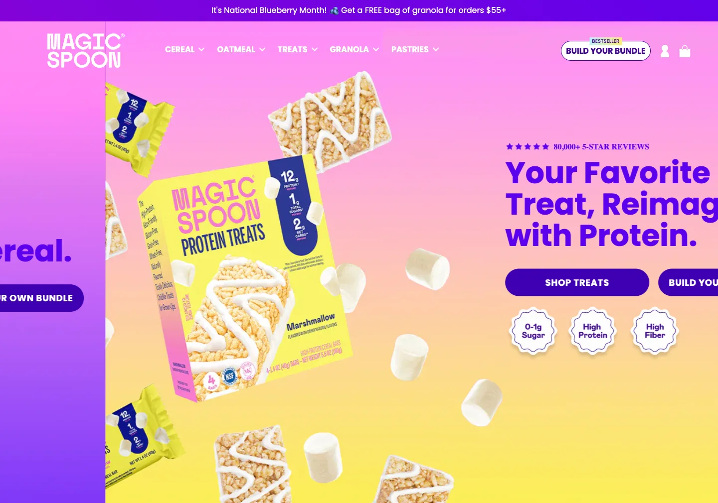
The home hero rotates through product promises ("Your Favorite Treat, Reimagined with Protein") but every slide stacks TWO equally weighted primary buttons (a "Shop …" button and "BUILD YOUR OWN BUNDLE") beside a row of trust badges (0–1g Sugar, High Protein, High Fiber) and the 80,000+ reviews cue. The reason to care lives in those small badges, not in the rotating headline.
Fix: Two same-weight CTAs on the first screen make a first-time visitor choose a path before they understand the product. I'd make one primary route ("Shop Best Sellers") and demote "Build Your Own Bundle" to a secondary link, and pull the strongest number (high protein, 0–2g sugar) into the headline or subhead so the reason to care lands before the click, not in a badge the eye skims past.
Directly under the hero the page runs a "Get your childhood favorites delivered monthly / Subscribe & Save 20%" block with a free bowl set, then a "Shop Best Sellers" rail led by the Cereal Variety 6-Pack ($54, down from $59, 21,825 reviews). Three ways to buy (bundle, subscription, best-seller) appear before any single recommendation.
Fix: The offer is rich but unranked, so a cold visitor sees three doors and no guidance. I'd lead the page with the best-selling variety pack as the obvious first purchase, keep subscribe-and-save as the upgrade on that pack, and let the bundle builder serve returning fans further down: one guided ladder instead of three parallel options on the first two screens.
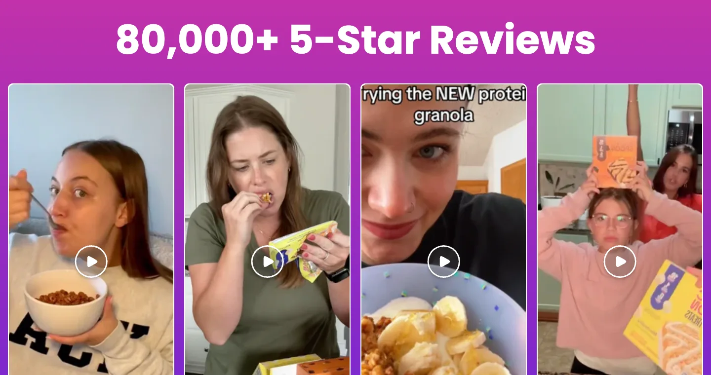
The home carries genuinely strong proof: "80,000+ 5-Star Reviews" with UGC video, a testimonial ("This was like a bit of good news coming to my house finally"), and an "available nationwide" band. But the same three benefits (High Protein, 0–2g Sugar, Sweet & Delicious) render as full-width bands TWICE on the 7,416px desktop page, separated by other modules.
Fix: The brand is clearly loved and the review volume is a real asset; the issue is repetition, not weakness. Two identical benefit bands add scroll length without new information. I'd keep one benefit band placed high, anchor the "80,000+ 5-star" stat next to the top CTA where it supports the decision, and cut the duplicate so the page stops restating itself on the way down.
The home merchandises three tiers of value in parallel (a "Build Your Own Bundle" builder, a "Subscribe & Save 20% + free bowl set" block, and a best-seller variety pack) presented as separate bands rather than a single path from "try one" to "subscribe and save".
Fix: A first-time visitor meets three ways to buy and no recommendation on which to pick. A Baseline pass turns the offer into one ladder (the best-selling variety pack as the entry purchase, subscribe-and-save framed as the upgrade on that exact pack, the bundle builder held back for returning fans) so the page tells the buyer what to do first instead of presenting every door at once.
Product page
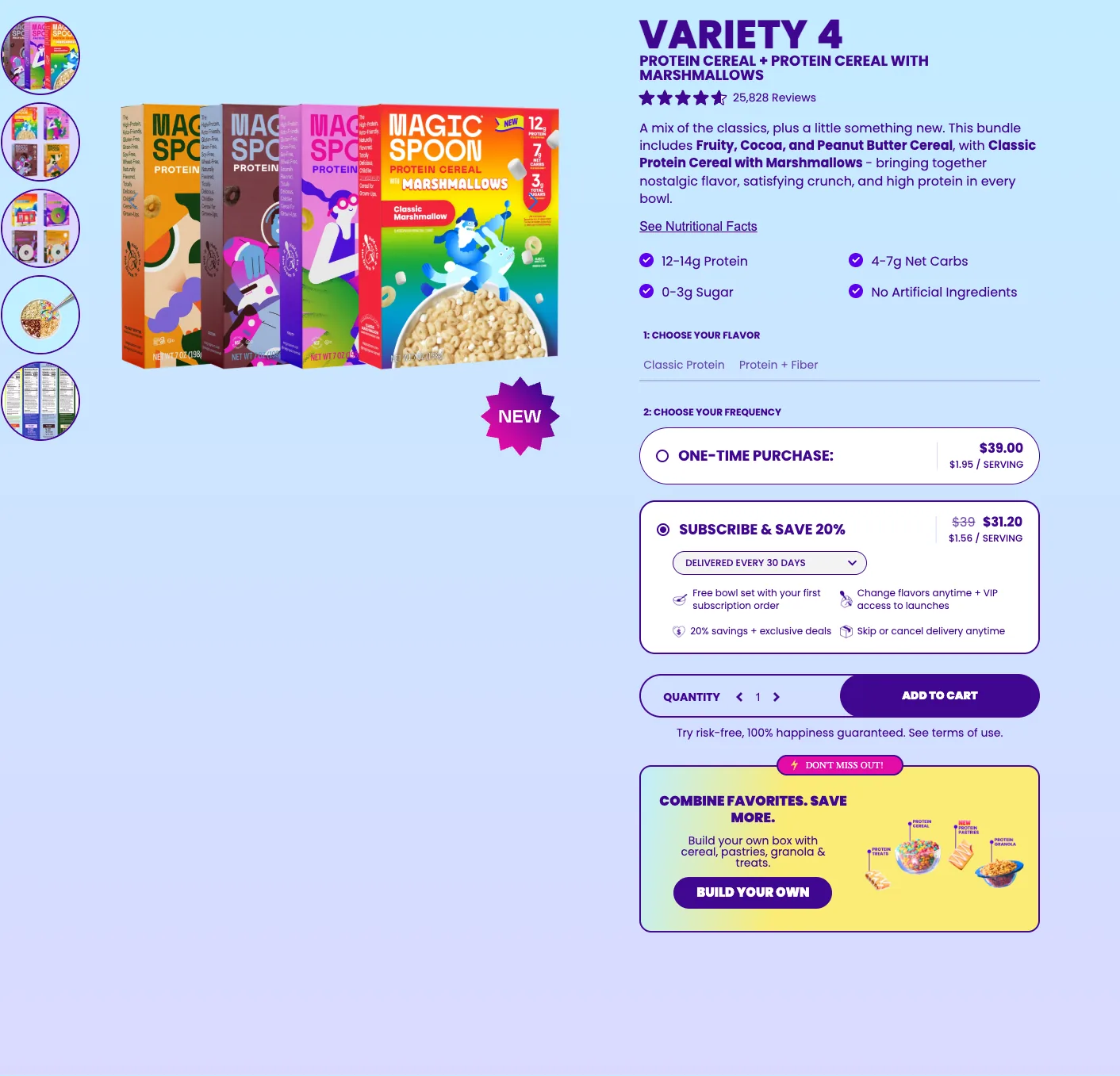
The PDP renders 8,514px tall on desktop and nearly 19,000px on mobile. The buy box sits at the top and is repeated once at the very bottom, but nothing is sticky between them: the ingredient paragraph, the US-vs-Them table, the 80,000-review UGC video, the "What Spooners Are Saying" grid, and the FAQ all scroll past with no persistent Add to Cart anywhere on screen.
Fix: This is the single highest-leverage fix on the store. On a page this tall, a shopper who reads the comparison table or the FAQ has to scroll all the way back to the top to buy. I'd add a sticky Add to Cart bar (price plus the selected plan and quantity) that slides in the moment the buy box scrolls off, so the yes stays one click away through the entire scroll.
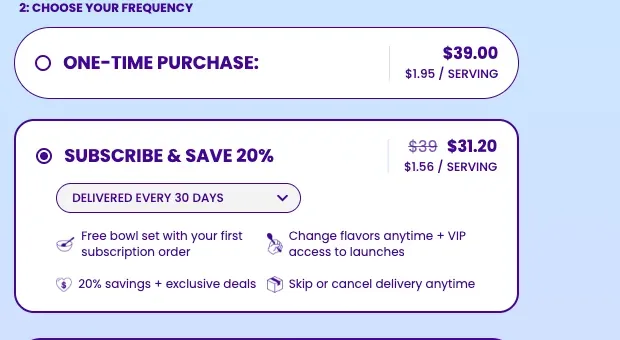
The purchase module opens with "Subscribe & Save 20%" pre-selected and "One-Time Purchase" as the secondary radio. A first-time buyer who just wants to try a box has to notice the toggle and switch it before adding, and the subscription's reassurance (change flavors, skip or cancel anytime) sits in small text below the Add to Cart button.
Fix: Defaulting to subscription lifts LTV, but it puts a recurring-commitment decision in front of a cold first-timer who isn't there yet. I'd test one-time as the default for first-session visitors (subscription stays one tap away), and move the "skip or cancel anytime" line up INTO the subscribe option itself, so the commitment reads as reversible at the exact moment of choice rather than as fine print.
Below the buy box the PDP stacks a full ingredient paragraph, the "US vs. Them" comparison table (protein, net carbs, sugar, calories, grain-free), an 80,000-review UGC strip, a "What Spooners Are Saying" review grid, and an FAQ accordion: every one strong, every one after the other, none of it summarized in the buy box, which carries only the plan selector and quantity.
Fix: Every persuasion asset the store needs already exists; it's the sequencing that's undesigned. In a Baseline rebuild I'd compress the wall into scannable modules and surface a compact trust line (protein grams, 0–2g sugar, net-carb count, 80,000 reviews) directly inside the buy box, so the reassurance arrives at the add instead of thousands of pixels below it.
Cart drawer
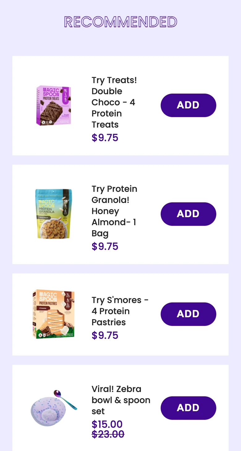
The cart runs a real "RECOMMENDED" cross-sell: four one-tap ADDs beneath the line item (Double Choco Protein Treats $9.75, Honey Almond Protein Granola $9.75, S'mores Protein Pastries $9.75, and a "Viral! Zebra bowl & spoon set" at $15 down from $23). What it lacks is any free-shipping progress bar or spend-more goal: the $39 subtotal sits with no threshold to push the order toward.
Fix: The cross-sell is the hard part and it is already built well: low-ticket, one-tap, relevant to the basket. The missing lever is a reason to add. A free-shipping or free-gift threshold bar above the recommendations ("You're $X from free shipping") turns each $9.75 tap into visible progress toward a reward, so the add-ons stop being optional and become the way to unlock it. Margin-check any new free-shipping tier before committing it.
The item lands in the cart as a one-time $39 purchase; the Subscribe & Save 20% offer and the "Build Your Own Bundle" builder (both prominent on the PDP) are absent from the cart. The only forward actions are Checkout, Continue Shopping, and the RECOMMENDED cross-sell.
Fix: The cart is the last place to convert a one-time buyer into a subscriber, and Magic Spoon drops the offer exactly there. I'd surface a single "Make it a subscription, save 20%" toggle on the cart line item, the highest-intent moment to upgrade the order into recurring revenue, plus a "finish your bundle" nudge for anyone who added à la carte. Both are second-sale moves the PDP already proves the store can merchandise.
Screens


What I'd fix
- 1Add a persistent sticky Add to Cart bar (price + plan + quantity) on the long PDP (8,514px desktop / ~19,000px mobile) so the buy action stays in reach through the ingredients, the comparison table, and the FAQ.
- 2Surface a compact trust line (protein · 0–2g sugar · net carbs · 80,000 reviews) inside the buy box instead of stranding the comparison table and reviews thousands of pixels below Add to Cart.
- 3Sequence the home into one value ladder (best-seller → subscribe-and-save upgrade → bundle builder) and cut the duplicate benefit band so the page stops repeating itself.
- 1Add a free-shipping or free-gift progress bar above the cart's existing RECOMMENDED cross-sell so each $9.75 add reads as progress toward a reward instead of an optional extra.
- 2Put a "Make it a subscription, save 20%" toggle on the cart line item: the highest-intent moment to turn a one-time buyer into recurring revenue.
- 3Carry the "Build Your Own Bundle" nudge into the cart for à-la-carte buyers, turning the PDP's bundle merchandising into an in-cart AOV lever.
Want this fixed on your store?