beverages (canned water) & merch · Teardown
Liquid Death
On mobile, where almost everyone lands, the buy box for the flagship water hands the high-AOV 12-pack straight to Amazon, so the owned store never sees the order, the customer, or the repeat. The brand voice is brilliant; the conversion architecture leaks margin off-site.
I opened Liquid Death on a phone the way most of their traffic does, and the voice grabbed me instantly, but the moment I tried to actually buy the water, the funnel handed me to Amazon. The mobile buy box opens disabled as "Select Size", and the second I pick the 12-pack it turns into "BUY ON AMAZON". That's the whole conversion event on a phone, and it routes the best order off the owned store entirely. Here's the first-screen-to-cart walkthrough on mobile, where the money is actually leaking.
Home page
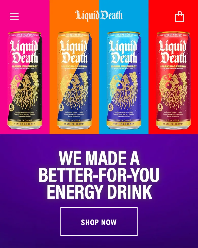
The mobile home is a vertical stack of full-bleed brand modules, each with its own divergent CTA: Sparkling Energy carousel → "SHOP NOW", "Death to Plastic Bottles" manifesto → "LEARN MORE", "Killer Merch" → "ADD TO CART", "Liquid Death Country Club" → "JOIN THE CLUB", "Death Peddlers" → "SELL LIQUID DEATH".
Fix: Five competing CTAs in one thumb-scroll means none of them wins. I'd pick one primary action ("Shop Water") and repeat it down the page with a sticky bar that follows the scroll, so the intent I had at the top is still one tap away at the bottom. The membership and affiliate side quests can wait below the fold.
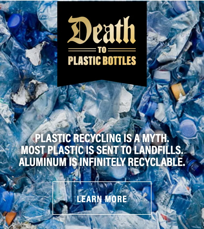
The "Death to Plastic Bottles" banner ("PLASTIC RECYCLING IS A MYTH... ALUMINUM IS INFINITELY RECYCLABLE") sits mid-scroll with only a "LEARN MORE" CTA next to it.
Fix: This is the single most persuasive argument on the page, and its only exit is into a content rabbit hole. I'd put a buy CTA right beside it: the moment someone nods at the mission is the moment to let them act on it, not send them reading.
An overlay modal ("keep your beverages ice-cold", a single EMAIL field, a big "HELL YES" button) covers the full mobile viewport, with consent copy referencing "cart reminders". The live incentive is 2 free can coolers, but that offer isn't shown in the modal itself.
Fix: It fires while I'm still orienting and takes the whole screen before I've seen a product: that's friction, not capture. I'd delay it to scroll-depth or exit-intent and put the 2-free-coolers offer right in the headline, so the value is visible at the moment of the ask. And the "cart reminders" promise rings hollow when the flagship product has no owned cart to abandon.
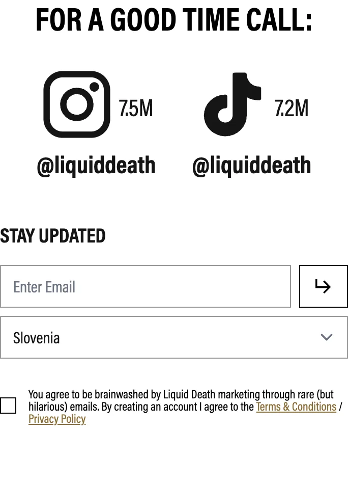
The Sparkling Energy carousel shows products as horizontally-swiped cards ("Tropical Terror — 5 Calories") under one shared "SHOP NOW": no per-card price, no individual buy. The "FOR A GOOD TIME CALL:" proof block (Instagram 7.5M, TikTok 7.2M) sits near the very bottom of a long scroll.
Fix: 7.5M and 7.2M followers are the strongest trust assets on the site, and they land after the decision is already made. A Baseline rebuild re-sequences the mobile home so proof and a buyable product sit near the top, and the carousel becomes individually buyable cards instead of an easy-to-miss horizontal swipe. This is hierarchy work: the brand system itself is excellent.
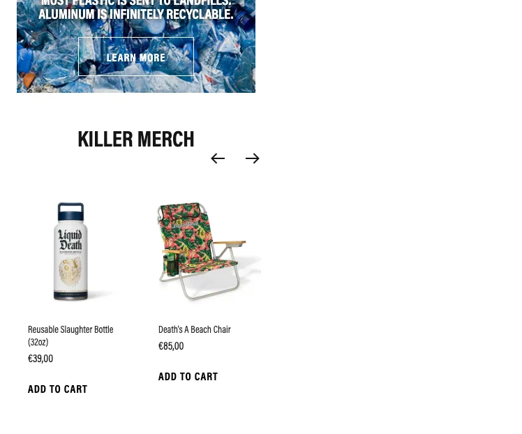
In the "KILLER MERCH" carousel, each card shows an image, name, a plain price (€39,00 / €85,00) and a text-only "ADD TO CART" link with arrow nav. The add-to-cart is rendered as unboxed black text, not a filled button, and only ~2 cards show at a time.
Fix: A thin text link is an ambiguous, easy-to-miss thumb target on mobile: the €85 chair, the highest-AOV owned product, gets the weakest possible add-to-cart. I'd make these full-width filled buttons with proper tap height, add variant pickers, and surface more of the range than two cards behind an arrow. This is core Baseline component work.
Product page
The flagship water PDP is one screen on mobile, and the primary button loads disabled as "Select Size". Pick "12oz 12 pack" and it becomes "BUY ON AMAZON"; pick "12oz Single" and it becomes "BUY NOW" express checkout. There is no Add to Cart on the core SKU at all.
Fix: I'd kill the Amazon fork on the highest-AOV variant first. On a phone this button is the entire decision, and routing the 12-pack off-site means the store never captures the order, the email, or the repeat: every value lever lives behind a door you just sent the customer through. Bring the multipack into an owned Add to Cart and keep the single off express checkout so it lands in a real drawer.
The flagship beverage buy box offers only "12oz 12 pack → BUY ON AMAZON" or "12oz Single → BUY NOW". There's no owned Add to Cart, no quantity bundle ladder, no "add a second case", and no subscribe-and-save at the point of purchase.
Fix: Canned water is the textbook subscription-and-bundle product, and the buy box surfaces neither. Bring the 12-pack into an owned checkout and you unlock a case-quantity ladder (1 / 2 / 4 cases) and a subscribe toggle right in the buy box: the two biggest AOV and LTV moves for a repeat-purchase drink. Any per-can incentive should be margin-checked, but even a small case-count nudge on-site beats handing the basket to Amazon.
Cart drawer
The site shows "Free shipping to Slovenia on all orders above €120.00". The only products that flow through an owned cart are merch (Reusable Slaughter Bottle €39, Death's A Beach Chair €85, "ADD TO CART"); the flagship water bypasses this cart via Amazon or express "BUY NOW".
Fix: €120 is a brutal bar when a €39 bottle is a third of the way there, and because the water never enters this cart, nobody can hit it by adding more drinks. On mobile there's no progress meter nudging toward the line either. I'd lower the threshold to something a single merch item can realistically reach, and show a live progress bar so the goal is visible.
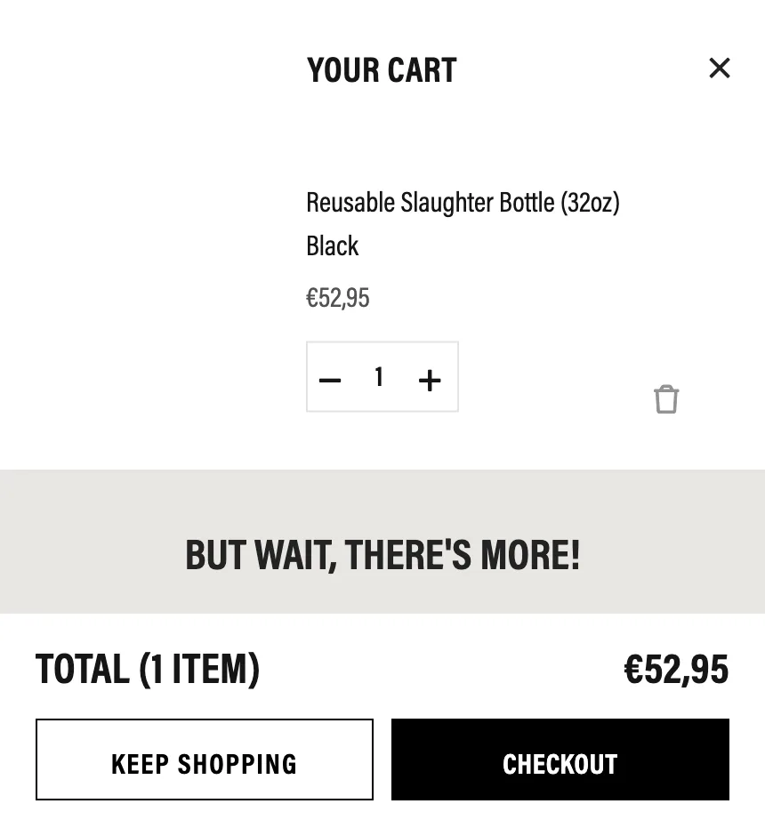
The owned drawer does run a cross-sell: a "BUT WAIT, THERE'S MORE!" rail of one-tap add-ons beneath the line item (Masked Death Can Cooler 2-Pack €12,95, Chewed To Death Dog Toy €10,95, Cat Toy €10,95, Licwid Deth Kids Tee €13,95). What it never shows is a progress meter toward the €120.00 free-shipping line, and the picks are catalogue-random (pet toys and a toddler tee) not accessories for the bottle the shopper just added.
Fix: The hard part is already built; it just isn't aimed. I'd retarget the "BUT WAIT" rail to bottle-relevant add-ons (koozies, coolers, stickers that pair with what's in the cart) and add a free-shipping meter so each €10–14 one-tap add reads as visible progress toward €120 instead of a random impulse. The flagship water still can't enter this owned cart at all, so the biggest attach of them all (a second case of drinks) never gets a chance.
Screens

What I'd fix
- 1Reclaim the flagship water into an owned mobile buy box with a real Add to Cart and a sticky ATC bar, so the store stops exporting the 12-pack to Amazon and finally owns the order and the customer.
- 2Re-sequence the mobile home so a single repeated "Shop Water" CTA and the 7.5M/7.2M proof sit near the top, instead of trailing five competing brand-module CTAs.
- 3Rebuild the merch cards as full-width filled Add-to-Cart buttons with real tap targets and variant pickers, and re-time the email popup so the 2-free-coolers value shows at the ask.
- 1Add an owned case-quantity ladder (1 / 2 / 4 cases, margin-checked per-can incentive) in the beverage buy box so multipack AOV is captured on-site, not on Amazon.
- 2Put a subscribe-and-save toggle in the water buy box to turn one-off Amazon hand-offs into owned recurring LTV.
- 3Add a free-shipping progress meter to the existing cart drawer and retarget its "BUT WAIT, THERE'S MORE!" rail from generic pet toys and a kids tee to bottle-relevant 1-tap add-ons (koozies, coolers, stickers) to lift both AOV and threshold attainment.
Want this fixed on your store?