supplements · Teardown
IM8 Health
A premium, authority-heavy brand that does proof better than almost anyone, and already upsells in the cart. The CRO opportunity isn't credibility; it's decision load and a marathon product page that buries its best value.
 Shopify
 Klaviyo
 Rebuy
Rebuy Gorgias
IM8 has the trust layer most supplement brands only dream of: David Beckham, athletes, clinicians, NSF certification, a clinical comparison, and value-stacking done extremely well. The CRO opportunity isn't credibility; it's decision load and length. The first screen and the buy box ask a lot before the visitor has committed to the one thing that matters, and the product page is a marathon that buries its strongest value. Walkthrough, grouped by page.
Home page
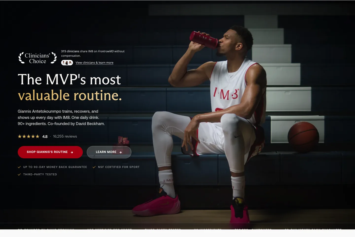
The hero leads with an athlete ritual ("the MVP's most valuable routine," Giannis training and recovering) over premium imagery, with an "as featured in" press row close behind. It lands the brand instantly, but the specific substitution promise (one daily stack that replaces a shelf of supplements) competes with the mood for the first screen.
Fix: Keep the athlete credibility; make the substitution promise the single loudest line in the hero. Authority brands still need the one-sentence "what is it and what does it replace" above the fold.

Strong, and worth protecting: "clinically proven, third-party tested, NSF Certified for Sport," a stat grid, clinician reviews, and 50M+ servings establish credibility early and credibly. This proof density is IM8's single biggest CRO asset.
Fix: Don't dilute it chasing a shorter page. The fix elsewhere is hierarchy and decision load, not trust: keep the evidence loud.
Product page
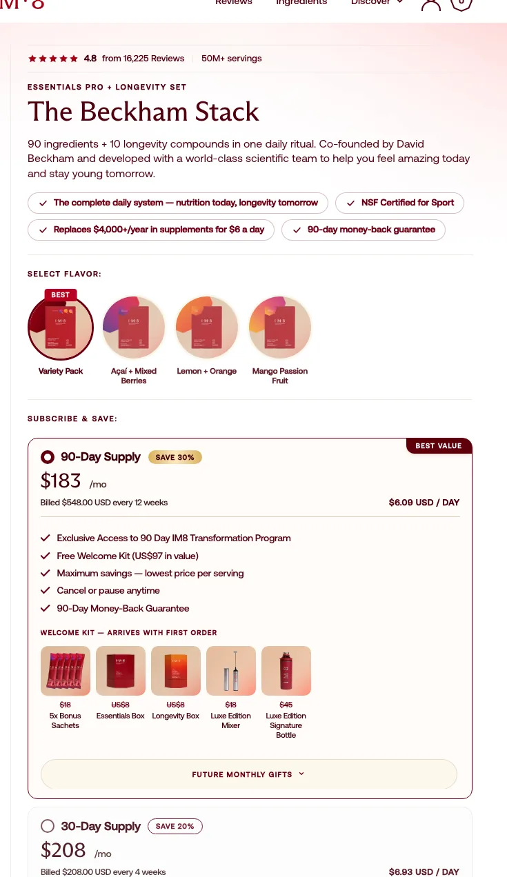
The buy box stacks several choices at once (variant (Essentials Pro + Longevity), a four-way flavour picker, 90-day vs 30-day subscription, and a welcome-kit gift list) all before a first-time buyer has decided to buy. That's decision load piled on the hardest decision. The 4.8-from-16,225 rating and the guarantee are doing good work up top.
Fix: Pre-select the recommended 90-day plan with a clear "Best value" tag and visually demote the rest. Make the default the easy yes; let everything else be a deliberate change, not a required choice.
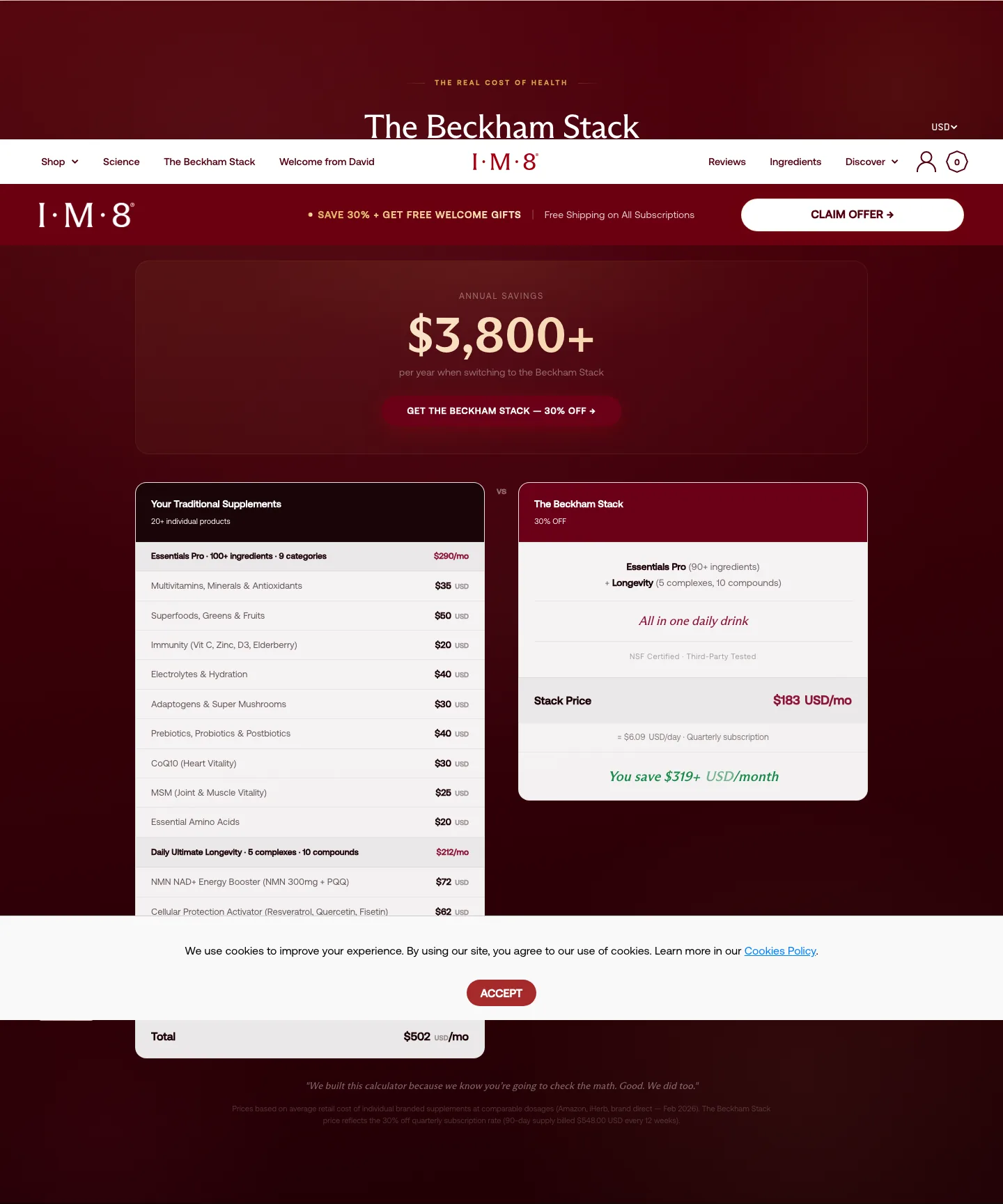
The product page is extremely long: dual-formula explainer, clinician reviews, a nine-organ-system breakdown, the cost comparison, a Beckham note, a scientific advisory board, FAQs. The material is excellent, but the buy box scrolls out of reach fast, especially on mobile, and the strongest value sits a long way down.
Fix: A Baseline rebuild adds a sticky mobile buy-bar so the decision is always one tap away, and restructures the scroll so proof and value support the buy box instead of trailing far behind it. This is page-system work, not a trust problem.
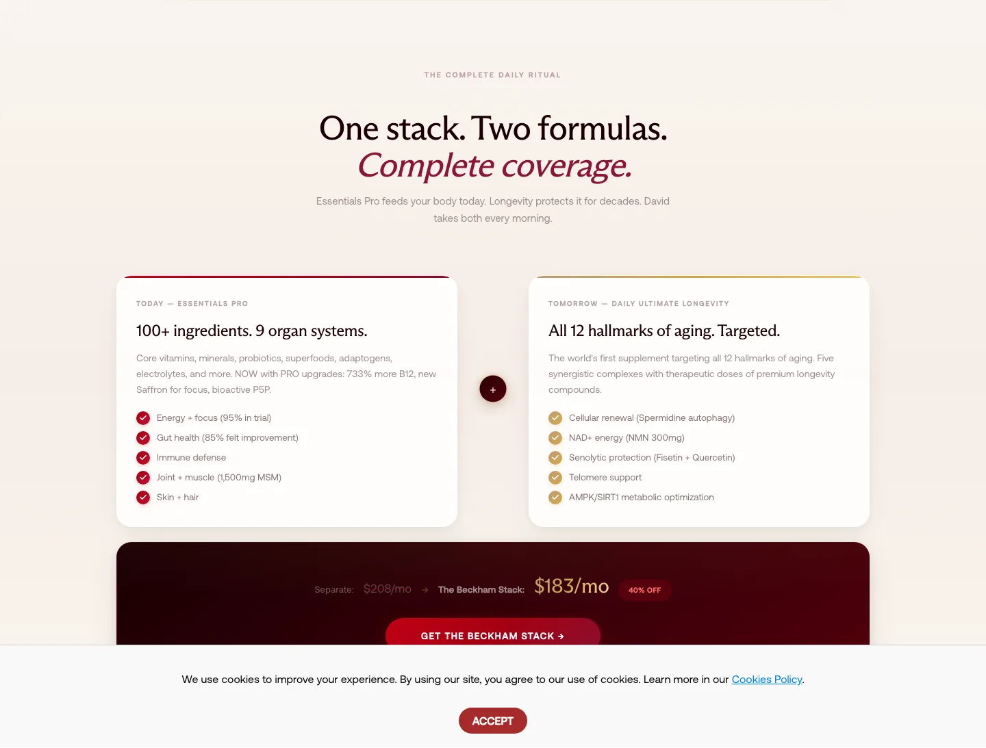
The "complete daily ritual — one stack, two formulas" framing and the "$4,000+ a year, replaces 20+ supplements" math are genuinely strong techniques, well executed. But they live mid-to-deep in the page, far from where the buyer decides.
Fix: Pull a condensed version of the value-stack up beside the buy box. Surfacing the strongest value framing at the decision point is core Baseline work: it makes the price feel earned before the visitor scrolls away.
The buy box does subscription and welcome-kit gifting well, but there's no low-ticket impulse add-on beside Add to Cart: nothing like a shaker, a travel single-serve pack, or a second-product trial to nudge the first order up or de-risk it.
Fix: Add one Upsellr bump (Product/Bump, Compact) next to Add to Cart: a shaker or a travel 7-pack. Keep it cheap and obviously useful; it shouldn't compete with the stack decision, just add to it.
Cart drawer
The cart drawer already runs more than most: a free-shipping reward bar and a "Complete your stack" cross-sell (the store is on Rebuy). The issue isn't presence, it's fit: the cross-sell leans toward an accessory (a travel pouch) rather than a consumable that drives the next order.
Fix: Keep the reward bar; re-point the cross-sell at a consumable (a refill, a flavour single, a travel sachet pack) so the cart upsell compounds replenishment rather than one-off accessory margin. Upsellr can target it off the active stack.
With the cart already this capable, the bigger miss is what comes after: there's no one-click offer on the post-purchase window, the highest-intent moment on a premium, trusted brand.
Fix: Add an Upsellr one-click post-purchase offer on the thank-you page (a travel pack or a complementary single), no re-entry of payment. Margin-check the discount against the stack's COGS, since the stack already carries bundle pricing.
The drawer lifts order value (reward bar, cross-sell) but it doesn't carry the trust the page worked so hard to build: there's no recap of the 90-day money-back guarantee or the value-stack at the final step, where last-second hesitation lives.
Fix: Add a one-line guarantee plus a condensed value recap inside the drawer so the momentum from the product page doesn't evaporate at checkout. The reward bar is already there: reinforce the decision, don't only upsell it.
Screens


What I'd fix
- 1Add a sticky mobile buy-bar so the decision stays one tap away through the very long product page.
- 2Surface a condensed value-stack ("replaces 20+ supplements / $4,000+ a year") and a proof capsule directly beside the buy box, not only deep in the page.
- 3Pre-select the recommended subscription and visually demote the alternatives so the default is the easy yes, not another decision.
- 1Add one low-ticket impulse bump beside Add to Cart (a shaker or a travel single): the buy box is all recurring plans with no cheap entry.
- 2Keep the cart reward bar, but swap the "Complete your stack" accessory cross-sell for a consumable (a refill or a flavour single) so it compounds reorders.
- 3Add a one-click post-purchase offer on the thank-you page: the highest-intent moment after a premium purchase is currently empty.
Want this fixed on your store?