beauty & skincare · Teardown
Glossier
A genuinely strong mobile beauty build: sticky shipping bar, thumb-reachable buy box, Afterpay, real bundle machinery. The conversion leaks are all about order and timing: an email wall owns the first screen, the AOV modules sit miles below the buy box, and the cart goes silent the second it tells you you are short of free shipping.
Roughly nine in ten people who hit Glossier are on a phone, and the mobile build earns real credit: a sticky free-shipping bar, a buy box with the price baked into the button, Afterpay framing, a subscribe toggle, and actual bundle merchandising. So this isn't a "they're missing features" teardown. It's an ordering-and-timing one. The first thing a thumb meets is a full-screen email wall, the money modules live a marathon scroll below the buy box, and the cart names a shipping gap then recommends nothing to close it. I walk it the way a phone buyer does: first screen, PDP, bag.
Home page
On mobile the very first thing that renders is a full-screen popup: 'Some light beach reading. Enter your email to be the first to know about offers, new product launches like Glossier You Soel, and so much more!', with an email field and 'Sign up' / 'No thanks' buttons. It overlays the value bar 'Free standard shipping on orders $40+', so a phone's entire above-the-fold is eaten by the modal before any product or shipping incentive is even readable.
Fix: This is the single biggest mobile-fold leak on the store. I'd fire the email capture on exit-intent or after one scroll instead of on load, and keep the free-shipping bar pinned above whatever the modal does, so the $40 threshold is the first thing a thumb sees, not a value cue buried under an interstitial.
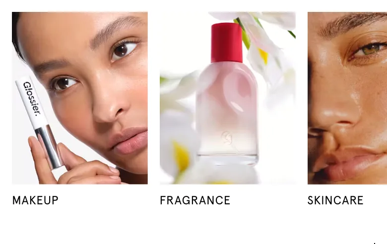
Once the popup is gone the home page leads with three square category tiles (MAKEUP, FRAGRANCE, SKINCARE) plus a 'SHOP ALL' link and a 'Shop now' button under them. On a phone those tiles, stacked on top of the dismissed modal, mean a shopper scrolls past a whole viewport of navigation before reaching the first buyable product (the Boy Brow carousel).
Fix: The tiles are good wayfinding, but they push the first 'Add to bag' out of reach. I'd pull one shoppable best-seller (the Boy Brow card already exists lower down) up above or interleaved with the category tiles, so a high-intent thumb can buy inside the first scroll instead of only navigating.
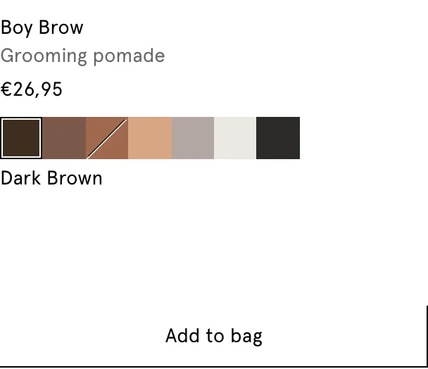
A horizontal product carousel shows a 'BEST SELLER' badge on Boy Brow: 'Grooming pomade', '$22', a row of shade swatches with 'Dark Brown' selected, and a full-width 'Add to bag' button. The next card is half cut off showing a 'MIX + MA…' badge, signalling a swipeable strip, but there are no dots or count to confirm it.
Fix: Inline shade selection plus a one-tap 'Add to bag' straight from the home carousel is strong mobile merchandising. I wouldn't touch it. The only risk is discoverability: the peek of the next card is easy to miss. I'd add a pagination indicator (dots or 'card 1 of 6') so phone users realise more best-sellers are sitting one swipe away.
Product page
The Glossier You Soie buy box stacks cleanly for a phone: title, 'Eau de parfum', a 4-star rating with '(352)', a 'NEW' badge, '50 ml / 8 ml' variant tiles, a 'One-time purchase' vs 'Subscribe and save 10%' radio with a 'Details' link, then a full-width 'Add to bag $82' button with the price baked into the right edge, and 'or 4 interest-free payments of $20.50 with Afterpay' below. The structure is excellent, but the ATC renders light grey, so on a bright phone screen the primary action is the least visually dominant element in the whole box.
Fix: I'd boost the ATC to a high-contrast brand colour and make it sticky on scroll, because this PDP is extremely long. The 'Subscribe and save 10%' toggle is also a bare percentage. I'd add a one-line value frame ('ships every 60 days, skip anytime') beside it so the subscription converts on emotion, not just the maths. Validate any subscription discount against your margins before locking the 10% in permanently.
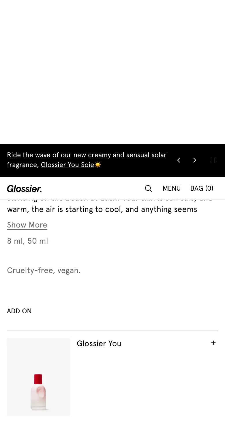
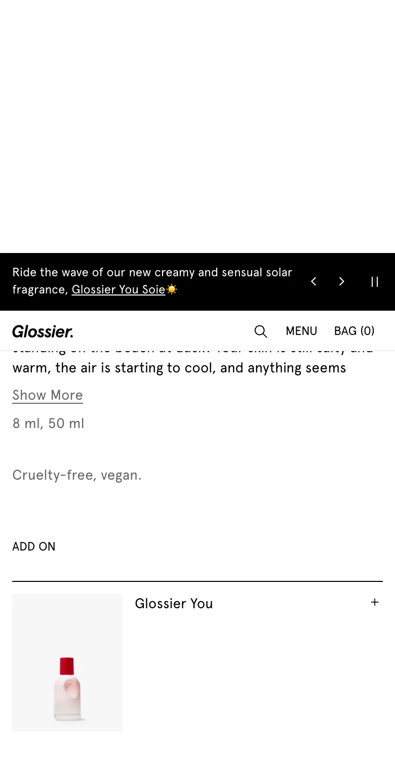
The description block ('You smell like vacation… Show More', '8 ml, 50 ml', 'Cruelty-free, vegan.') sits between the buy box and the money-making modules. The 'ADD ON' bump and the 'SAVE WITH SETS' bundle stack only appear after that copy, deep into a page that also carries scent notes, a 352-review section, and a 'YOU MAY ALSO LIKE' carousel. So on a phone, the add-on and bundles land several thumb-flicks below the 'Add to bag' button.
Fix: By the time a mobile shopper scrolls that far they've usually already tapped 'Add to bag' or bounced, so the AOV modules fire after the decision instead of during it. I'd surface a condensed version of the 'ADD ON' bump and the top set (Fragrance Trio, SAVE 21%) immediately under the ATC, before the long-form copy, making the upsell part of the buy decision rather than a post-scroll afterthought. This is sequencing work, not a redesign; the components are already good.
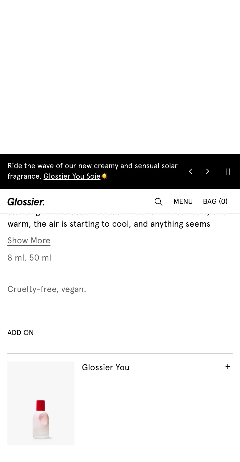
Below the description an 'ADD ON' module shows a single product ('Glossier You') as a thumbnail row with a '+' control on the right, a one-tap bump that adds the companion fragrance without leaving the PDP. It does its job, but it's a dead end: it offers exactly one item, and the live cart never echoes it as a cross-sell once the drawer opens.
Fix: I'd make the bump dynamic (two or three high-attach companions such as the 8 ml travel size or Futuredew, which already shows up in 'You may also like' at $30) and, more importantly, mirror the same add-on inside the cart drawer. A shopper who skipped it on the PDP then gets a second shot at the exact moment they open their bag.
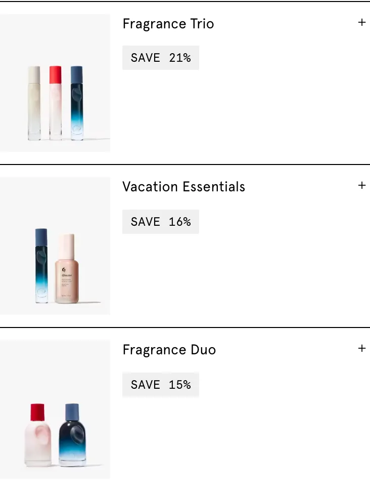
A 'SAVE WITH SETS' section lists three expandable bundles, each with a thumbnail, a '+' control and a savings chip: 'Fragrance Trio SAVE 21%', 'Vacation Essentials SAVE 16%', and 'Fragrance Duo SAVE 15%'. Every row ships collapsed by default, so the bundle contents stay hidden until tapped, and the whole block sits low on the PDP.
Fix: This is genuine, well-built bundle merchandising with quantified savings: it just hides where mobile shoppers never reach it. I'd pull at least the highest-saving set (Fragrance Trio, SAVE 21%) up near the ATC, pre-expanded, with a 'buy this set instead' frame so the bundle reads as an upgrade to the single 50 ml rather than an unrelated extra further down.
Cart drawer
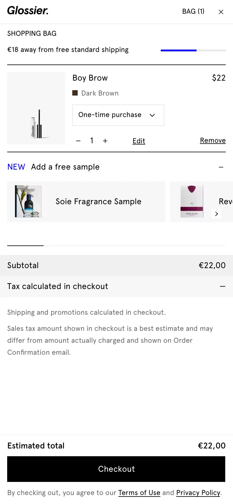
The headless 'BAG' drawer carries a free-shipping progress bar that reads, for an under-threshold cart, '€70 away from free standard shipping'. There is nothing else in the drawer to help close that €70: no recommended products, no add-on, nothing. The progress bar is the only AOV cue, and it points at a gap the shopper has to leave the drawer to fill.
Fix: Telling a phone buyer they're €70 short and then showing them nothing to add is the costliest gap in the whole funnel: the threshold creates intent and the drawer kills it. I'd drop two or three in-drawer recommendations sized to clear the gap: the same 'Glossier You' add-on and the 8 ml travel size already merchandised on the PDP, so the cart actively helps the shopper qualify instead of sending them back out to hunt for filler.
The empty-bag state reads 'Your bag is empty, but you still look good.' with a smiley and a single 'Shop all' link. No recommended or best-selling products appear in the empty drawer at all.
Fix: Lovely brand voice, dead-end conversion: 'Shop all' just dumps the shopper into the full catalogue. I'd seed the empty drawer with two or three best-sellers (Boy Brow $22 is the home-page hero, Futuredew $30) so the first action from an empty bag is adding a known winner, not browsing from scratch.
Screens

What I'd fix
- 1Raise the contrast on the PDP 'Add to bag $82' button (it renders light grey today) and make it sticky down the very long mobile page, so the primary action stays the most dominant, always-reachable element in the buy box.
- 2Frame 'Subscribe and save 10%' with a one-line benefit (cadence plus skip-anytime) beside the toggle instead of leaving it as a bare percentage radio that converts on maths alone.
- 3Reorder the long mobile PDP so a condensed add-on and the top-saving set sit directly under the ATC, before the long-form copy, instead of several thumb-flicks past the buy decision.
- 1Mirror the PDP 'ADD ON' (Glossier You) and the 8 ml travel size inside the cart drawer, scaled to close the '€70 away from free standard shipping' gap that currently dangles with nothing to add against it.
- 2Pull the highest-saving set (Fragrance Trio, SAVE 21%) up under the ATC, pre-expanded and framed as an upgrade to the single 50 ml, instead of leaving 'SAVE WITH SETS' collapsed far down the scroll.
- 3Seed the empty 'Your bag is empty, but you still look good.' state with two or three best-sellers so an empty drawer becomes an add-to-bag moment, not a 'Shop all' dead end.
Want this fixed on your store?